69th TDC Annual Competition Winner
„Each 30 tells a story of growth.”
Interview with YiFei Hu*,
designer of Happy B-day project.
by Olha Lysenko, Viktoria Yastremska, Tetiana Lundiak, Inesa Shostak, Aleksandra Wiatrak & Anna Gaj
(May 2024)
Could you tell us more about yourself and what influenced your decision to pursue a career in design?
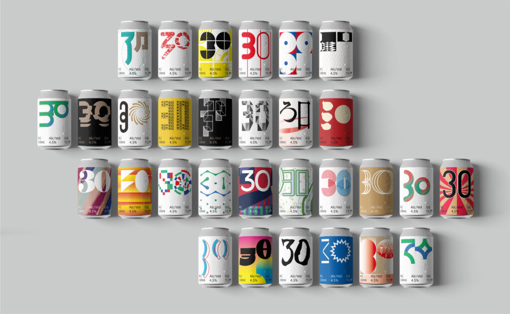
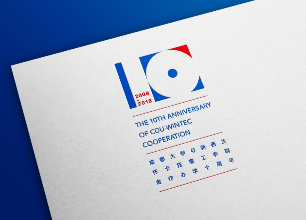
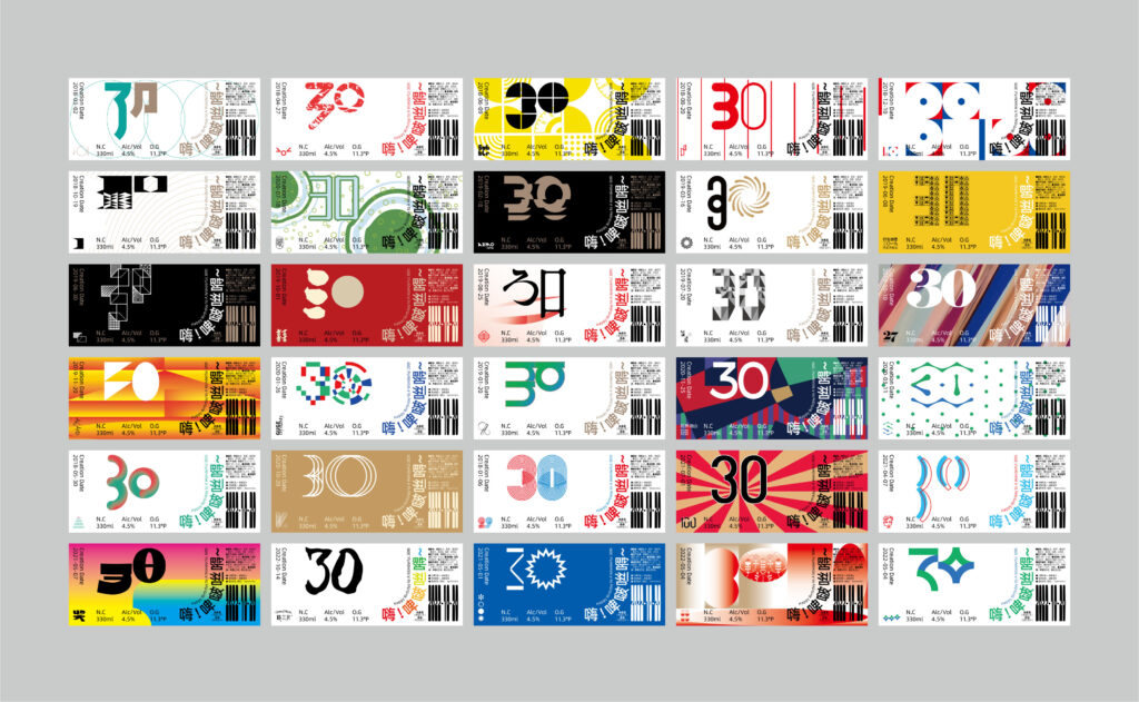
I’m a graphic designer from Chengdu, China, and also a design teacher at Chengdu University. My main focus is on brand, packaging, and typography design. I studied art design after university, so I got into the design field much later than most Chinese designers. I decided to pursue a design career after creating the event visuals for the 10th Anniversary of the CDU-WINTEC Cooperation in 2018. The project received a lot of praise, which made me realize I could strive to become an excellent designer. The can for this project is the fifth in the first row of „Happy Birthday.”
What was your inspiration for combining your passion with professional work?
I’ve always enjoyed having a drink. As many know, alcohol can help people feel more relaxed, ease anxiety, and bring a sense of comfort. When my design projects achieve success, I celebrate with friends over drinks. And when I face challenges or pressure in my work, I sometimes unwind with a drink to help manage stress. The „Happy Birthday” project was a personal gift I wanted to create for myself before turning 30. One day, inspiration struck, and I realized I could combine two things I love: design and enjoying a good drink.
How does the ‘Happy Birthday’ project reflect your growth as a designer?
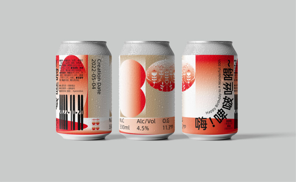
I actually took visuals from 30 different projects I designed between 2018 and 2022 and turned them into the „Happy Birthday” visual. You can view these 30 beer cans in order, from top to bottom and left to right, in a complete image. I arranged them chronologically according to when each project was completed. From this order, you can see how my design skills have gradually improved. So, each of the „30” is a moment that shows how I’ve developed as a designer. Each „30” tells a story of growth.
What were some of the biggest challenges you faced while designing the 30 cans, and how did you overcome them?
To be honest, there weren’t any major difficulties or challenges. The design for this project only took one night, and it was sent out for production the next day. If I had to mention a challenge, it would be that I had to find the source files for these works one by one from my past projects. Hahaha.
What is your favorite can design? Does it have a special meaning for you?
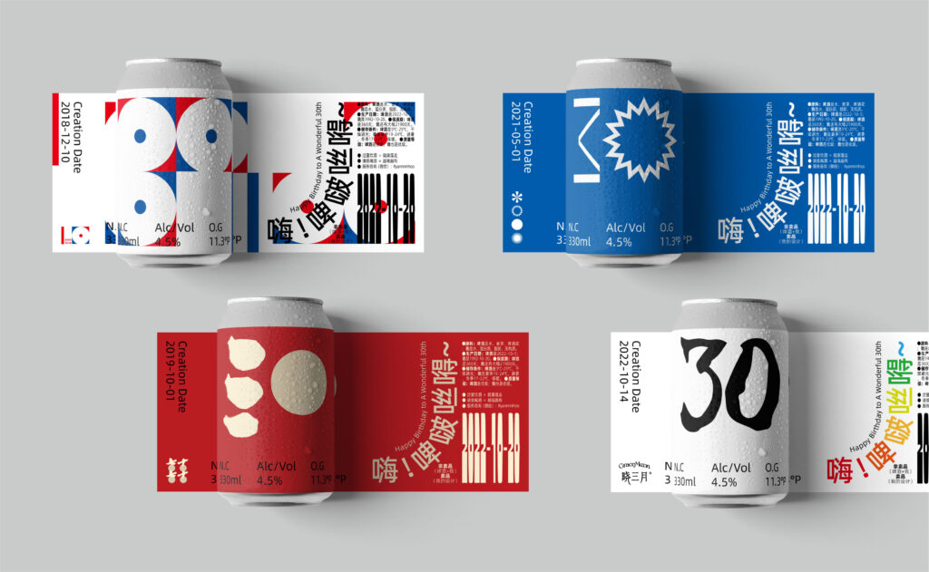
Actually, every can has a story. If I had to choose one, it would be the second to last one. The design of this can is inspired by the wedding visual identity I created for my best friend. Designing this wedding visual was very memorable and meaningful for me. I wanted the wedding visuals to be unique and symbolic, so I compared the newlyweds to two trees standing side by side in love (with different details for the male and female leaves). Their branches and leaves grow separately but echo each other. Based on the „6”—which in Chinese culture symbolizes harmony, success, luck, and fertility—the hexagonal shapes in the design include symbols like Pomegranate, Orange, Peach Blossom, Peony, Gourd, Double Happiness (囍), and Ruyi patterns. These symbols hang on the branches, representing marital harmony and family unity. The interconnected branches and leaves form a shape of love, symbolizing the union of love and the birth of new life.
How did you keep consistency across the 30 unique designs, and what ties them all together? Is there a specific sequence or order you follow when arranging the can designs?
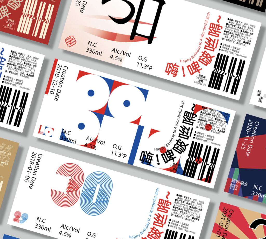
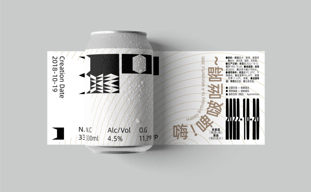
The consistency across these 30 different cans is maintained by using the same layout on each label. For example, the upper left corner shows the date when the project was completed, and the lower left corner features the logo of that completed project. The front has „30” and the beer’s specification information, while the right side includes the Chinese and English text for „Happy Birthday” arranged in a specific way. The upper right corner has the product information, and the lower right corner displays my birthday, „2022-10-20.”
Have you used any symbols or elements from Chinese culture in your designs? If so, which ones have you included, and what inspired you to use them? Also, how does Chinese culture influence your work?
Yes, I’ve incorporated elements like Chinese calligraphy, Chinese characters, and Chinese colors. Chinese culture is definitely a major source of inspiration for my work. It helps me uncover the core meanings or concepts I want to express. I also aim to blend Chinese cultural elements with international design styles in my creations. For example, the wedding visual design I did for my friend reflects this fusion.
You’re combining Chinese and Latin scripts here.
This bilingual layout is designed to make the work understandable for both Chinese and international audiences. But I also have works intended solely for Chinese audiences, which feature only Chinese layout designs.
Could you explain the correlation between the unique icon located in the bottom left corner and the design of number 30?
As mentioned earlier, the logo design or core element of the completed project is in the bottom left corner. It only indicates where the design visual on the can comes from, which is not necessarily related to „30”. However, each can is a growth story. But I think it’s hard to explain clearly. I can send you some design cases and you can find out which they correspond to.
In looking at your design, we noticed two important dates: '2022-10-20,’ which is constant, and the creation date on each can. Could you tell us more about the significance of these dates? What does '2022-10-20′ represent, and why is the creation date important? Is there any personal or contextual meaning behind these dates?”
The creation date represents that the visual elements on this can came from that project at that time, so the date is also the date when that project was completed. And „2022-10-20” is my 30th birthday date. The order of the cans in the picture is arranged according to the creation date.
* The pronunciation of Yifei Hu’s name sounds like “E Fee Who,” and in Chinese, it is written as 胡怡飞。
The material has been created as part of the Spring 2024 Semester assignment for the Elements of Visual Communication Theory (EVCT) course, conducted by Dr. Monika Marek-Łucka at the Polish-Japanese Academy of IT in Warsaw. We would like to express our gratitude to the designers awarded at the TDC Annual Competition for contributing to the creation of high-quality educational materials.
Illustrations source: https://www.oneclub.org/awards/tdcawards/-award/46336/happy-birthday

