Reportage:
>>Zostaną tylko książki.<< — Spine Studio w Kopenhadze
Author: Monika Marek-Łucka
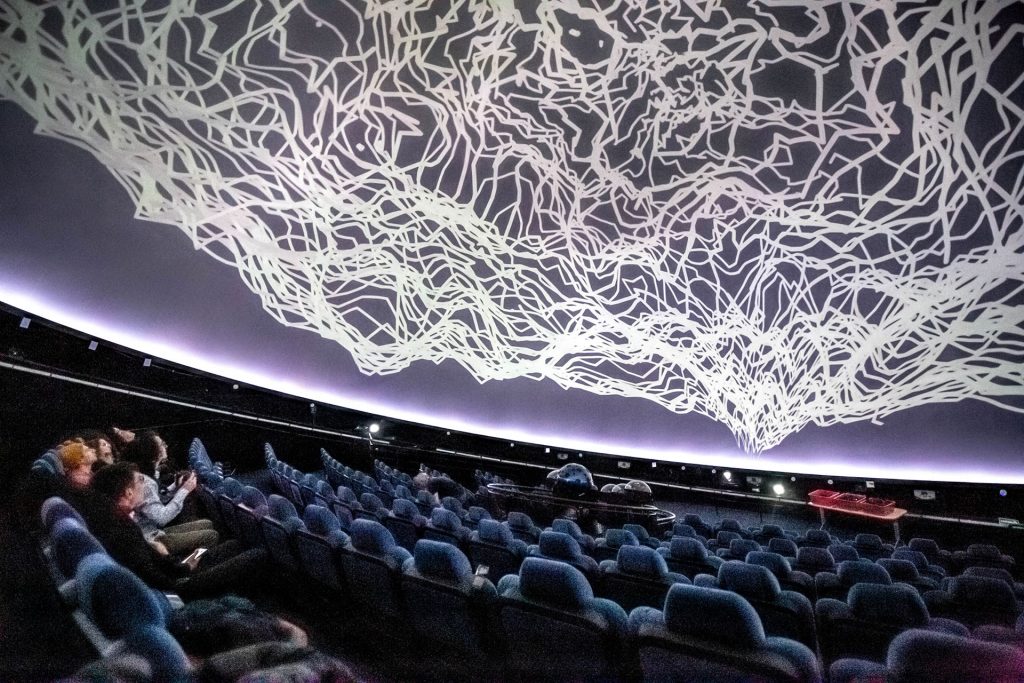
The ATypI conference is to the world of typography what the Oscars are to the world of film. Just as it's hard to imagine an actor who hasn't heard of them, it seems improbable to practice the "black art" of typography - as a typeface designer or as a typeface user - without reference to ATypI's heritage. This is one of the world's oldest typographic organizations, whose annual conferences have been held continuously since 1957. It is now an established practice that a sequence of lectures, presentations and discussions precedes a day of workshops and study visits. This allows conference participants to visit the most prestigious design studios for a given city.
Such direct experience of being immersed in the atmosphere of a particular studio
and approach to design, always works invigoratingly for both parties.
The studio gets an unmediated and bathed in a pleasant froth of compliments
audience's reaction to its designs, and visitors - in addition to reliable knowledge (and gadgets)
- take away a whole heap of inspiring thoughts.
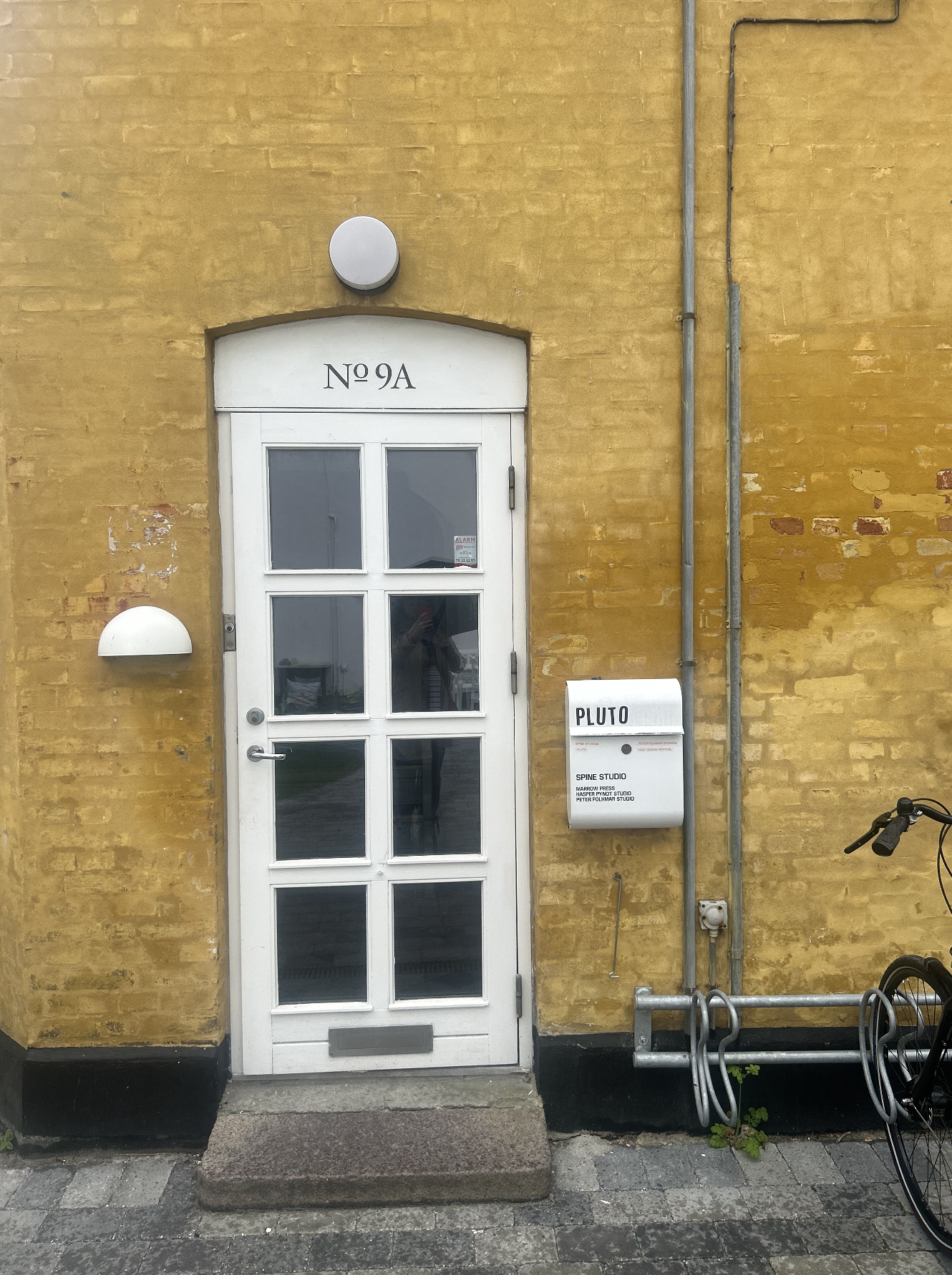


While in Copenhagen this year, I visited Spine Studio, located in Frederiksberg, one of the city's oldest, most prestigious and intensely green neighborhoods. The studio is headquartered on Svanemosegårdsvej Street, in a small one-story house colored Neapolitan yellow, at the back of the courtyard. There are parked bicycles by an inconspicuous white door, a small greenhouse further on, and a garden table with benches. When it turns out that I still have at least a quarter of an hour until my appointment, I start looking around. An exercise in looking. I quickly catch a charming detail - the apartment on the second floor of the house behind which Spine Studio is located has three shelves of cacti stacked in all (sic!) windows. A peculiar collection. It's hitting 11:00 a.m. Slowly the other conference attendees begin to join in, and soon, already as a group of six design enthusiasts, we're heading for the front door.
Spine Studio was founded by Jacob Haagen Birch and Finn Wergel Dahlgren as a place to create visual communications for entities in the world of art and culture. The bulk of the projects are publications - from exhibition albums to experimental publications. This becomes apparent as soon as you cross the threshold, where a round table lavishly set with books awaits. The fascination with books also betrays the very name of the studio - "spine" in typographic terminology means the spine of a book.
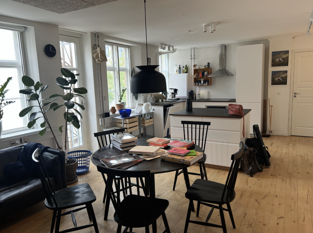
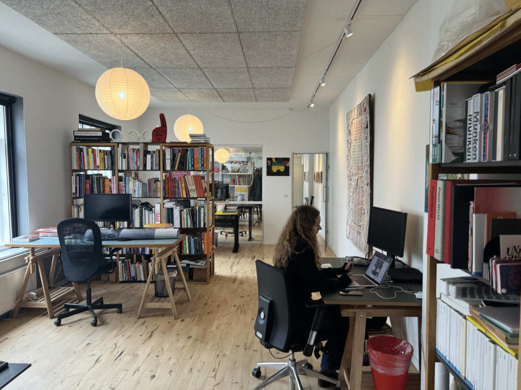
The studio is actually a homogeneous space with the proportions of a very long rectangle. The representative and guest part is separated from the workshop part by a wall of bookshelves and a navy blue sofa. We have the impression of a casual meeting in a cozy kitchen. Literally - because in addition to the island, there is also a kitchen back room. This intimacy is the result of a very thoughtful strategic decision by the studio.
"We're a small studio, but that's what we want to remain,"
- says Jacob - "Big studios require big clients.
We, on the other hand, are more idealistic.
We want to do idealistic projects and not be dependent on anyone."
The consequence of this approach was the establishment of its own publishing house in 2023. Marrow Press deals with non-fiction publications in the field of visual arts (photography, architecture, design). It is a project with high ambitions to create "high-quality contemporary publications with content that moves." "high-quality contemporary publications with content that moves you".1). However, publishing independence requires financial independence. In this regard, Jacob and Finn have developed their own way of budgeting for publications by applying for grants. Acquiring funding for a project based on a specific idea and project direction, allows them to limit the micromanagement of the funding entity in the later stages of the work. The grant-giving institution, once familiar with the overall design direction of the book, does not influence decisions related to the creative process at a later stage of the work. Creative freedom and trust in the designer, understood in this way, are key values of the studio.
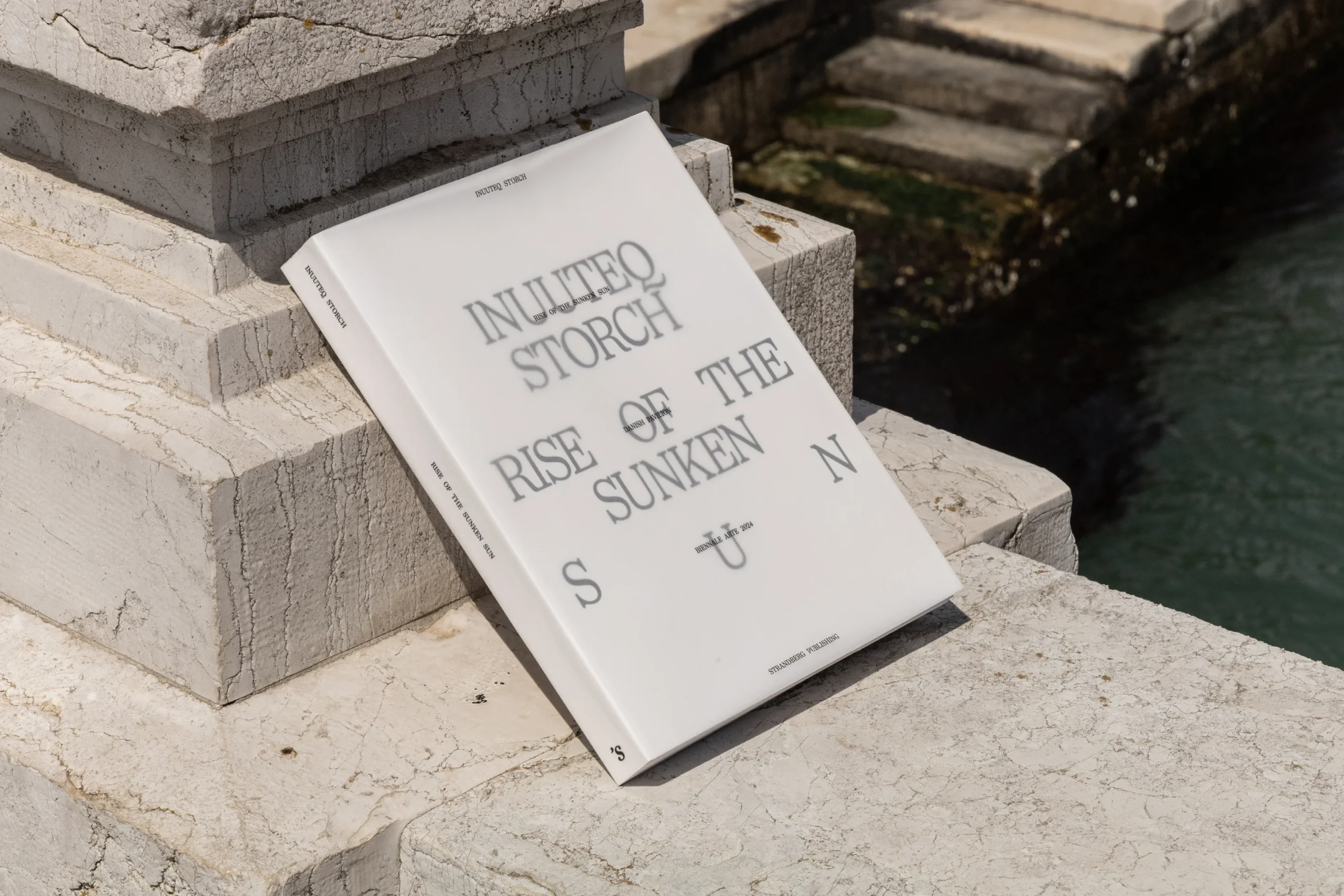
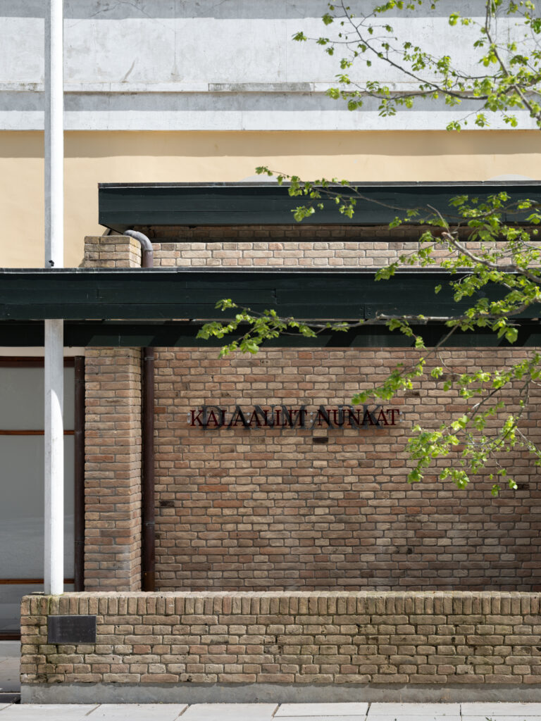
The course of our conversation is determined by each publication. Since each book is a unique answer to a unique problem, when we talk about a particular book, we touch on a particular aspect of design work. "Rise of Sunken Sun"2(published by Strungberg Publishing 2024) becomes a contribution to the conversation about postcolonialism, empathy in design and performative reading. The album documents an exhibition in the Danish pavilion at the 60th International Art Exhibition - La Biennale di Venezia 2024, featuring a series of photographs by Greenlandic artist Inuuteq Storch3who undertook the task of portraying the true face of Kalaallit Nunaat. This is a Greenlandic language term meaning "land of the people," or Greenland. In his project, Storch points out that while Greenland has already been extensively documented, it has been almost exclusively from an external - oppressive and colonial - perspective. By belonging to an island community, Storch opens up a personal Greenland, woven from "small stories" in which the rhythm of everyday life is intertwined with the imperceptible, intangible and elusive.
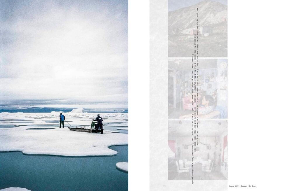
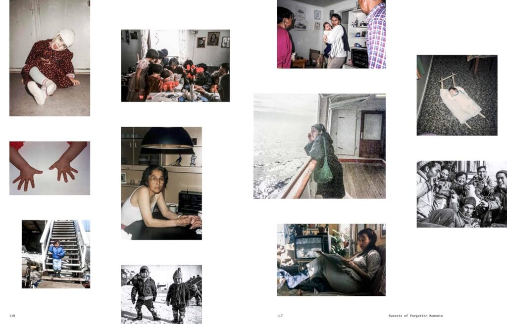
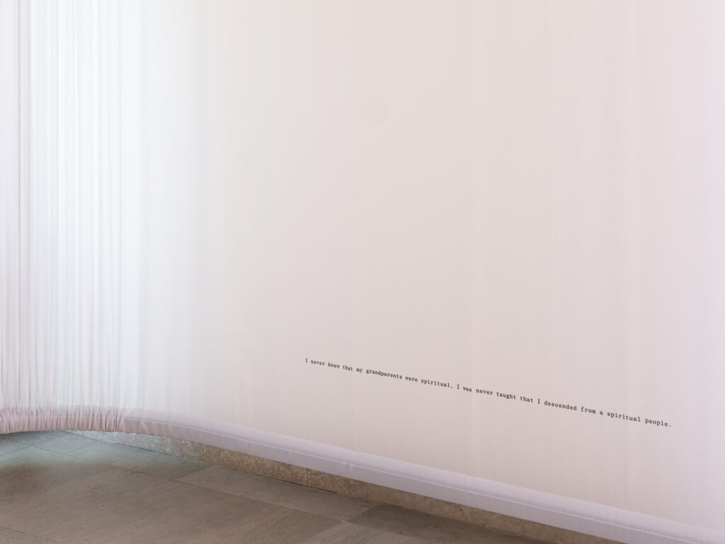
This interpenetration on different levels becomes the visual motif of both the exhibition and the album. Thus, we have the use of papers of different transparencies, bringing to mind the misty landscape of Greenland and the mystique of Inuit spirituality, or the composition of texts of two narratives - personal and scientific - in two typefaces, and in two reading directions. If the reader would like to discover Greenland in the stories of its people, he or she is forced to abandon his or her reading habits and forget about the comfortable reception of the text. Discovery happens here through performative reading, requiring at least a twist of the book. In the Danish pavilion, performativity additionally meant activating the body: personal texts were placed along the wall at a very low height - not much above where the wall and floor meet.
It was only possible to read them in a certain position
- sitting, reclining, or crouching - a bit like this,
as one listens to stories around a campfire.
Also performative was the marking of the Danish pavilion, where the letters forming the country's name "Denmark" were overlaid with the letters of the Greenlandic name "Kalaallit Nunaat." The book was created in close collaboration between the designers, the curator and the artist, which helped to give it a value beyond mere documentation of the event. The project allows capturing something of the direct experience of the exhibition itself. "This album," Jacob adds, "is the only physical remnant of the exhibition. Exhibitions are ephemeral - only books remain." The life of "Rise of Sunken Sun" goes on. In 2025 it was awarded a bronze medal at Denmark's most prestigious design competition Årets Bedste Bogarbejde4, organized by the Book Craft Association.
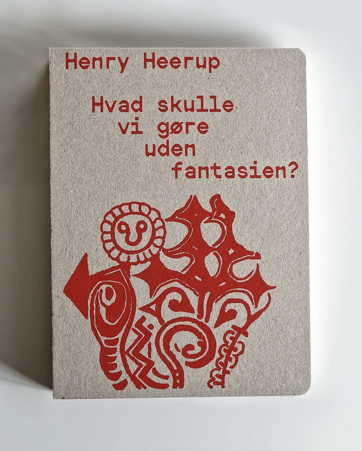
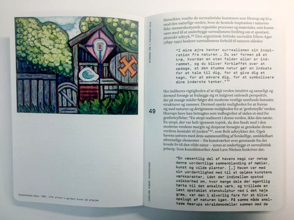
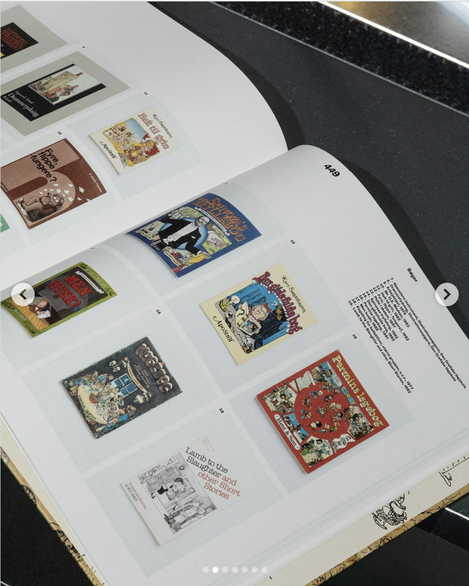
Two other publications covered by Jakob and Finn are monographs on Danish artists - painter and sculptor Henry Heerup, and Danish comics creator Claus Deleuran. Heerup's visual language is raw, radical and highly expressive, and his work itself is diverse. The artist moved freely in the registers of magical realism, primitivism, psychedelic art. He was one of the members of the Danish avant-garde group COBRA. He very often introduced lettering elements into his compositions. The characteristic double "e" from his signature, became part of the logotype of the museum storing the artist's legacy. The book, designed by Spine Studio, accompanied Heerup's retrospective exhibition at Kunsten Museum of Modern Art Aalborg (09.2023-04.2024) titled "What would we do without imagination?". This creative uninhibitedness and open form thinking Jakob and Finn have carried over into the shape of the publication. First, instead of a large album format (coffee-table books), they opted for a handy size reminiscent of so-called pocket books. The book, with its characteristically rounded page corners, also resembles a travel notebook. After all, Heerup was an artist constantly on the road, on the move, in search of visual form. Second, they conveyed the rawness of Heerup's visual language by using uncoated cardboard and an open spine for the cover. And third, they found one, a typeface that allowed them to faithfully transfer Heerup's pictorial language into a typographic dimension.
"How do we adjust the typography?" - Finn echoes my question.
"We look for features that coincide with the subject of the publication itself.
In the case of Heerup, I was enthralled by the letters,
resembling sculptures with cut-out elements."
The font Finn is referring to is Neureal5 designed by Laura Csocsán as a graduation project at ECAL/Ecole cantonale d'art de Lausanne (2022). It was used in the publication for titles, quotations and illustration captions. The artwork's text was assembled with the Gaisyr typeface (designed by Berlin-based studio Dinamo) - seemingly a neoclassical antique, but edgy enough to allow the reader to immerse himself in Heerup's world, which does not lend itself to easy pigeonholing.
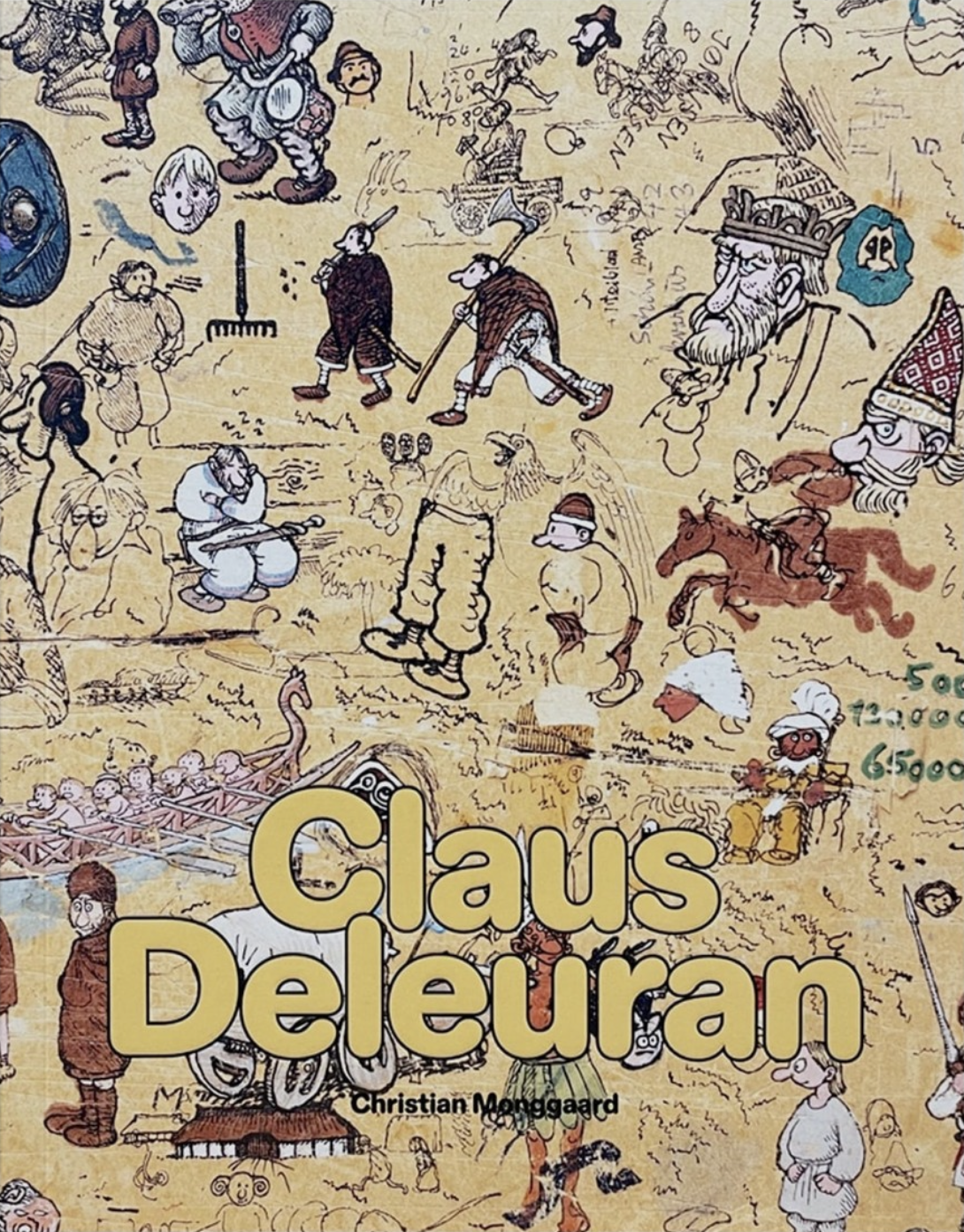
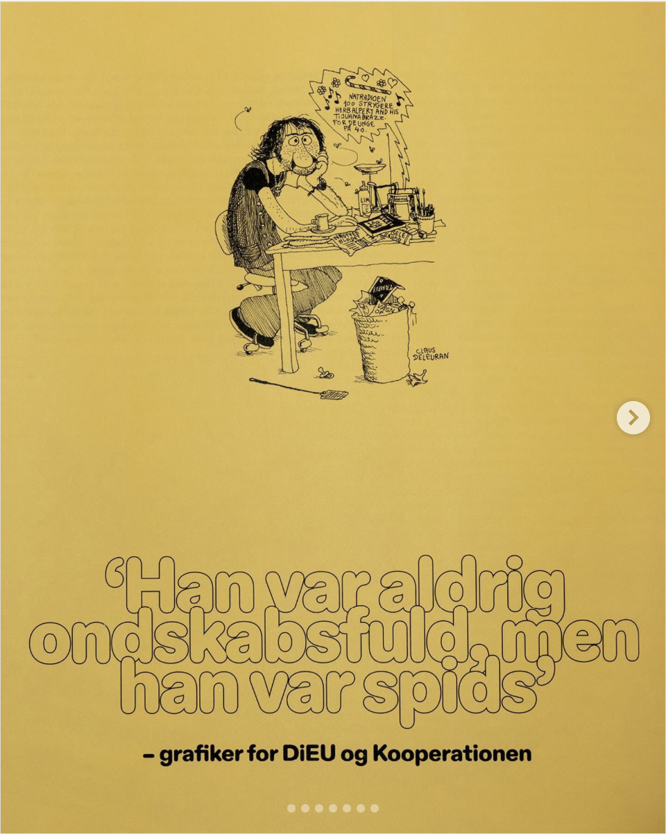
The second monograph is a book-object, book-furniture, book-giant,
which pays homage in such an exaggerated form to an iconic figure
for Danish comics - Claus Deleuran.
The design challenge for this publication (published by Book Lab 2023) was to find a typeface that would correspond with the artist's illustrative style. In other words, a font that would be sufficiently cartoonish and, on the other hand, show the restraint necessary to support the composition of serious curatorial studies. The composition of the table of contents, chapter titles and highlights in this typeface with negative interlineation became an interesting typographic motif. As a result, the top and bottom extensions of the letters of successive lines of text overlapped. Such a design decision in itself belongs to the canon of typographical errors. Here, however, the deliberate departure from the principle of correct text composition became a tool to convey in the medium of typography the wryness of the artist's visual language.
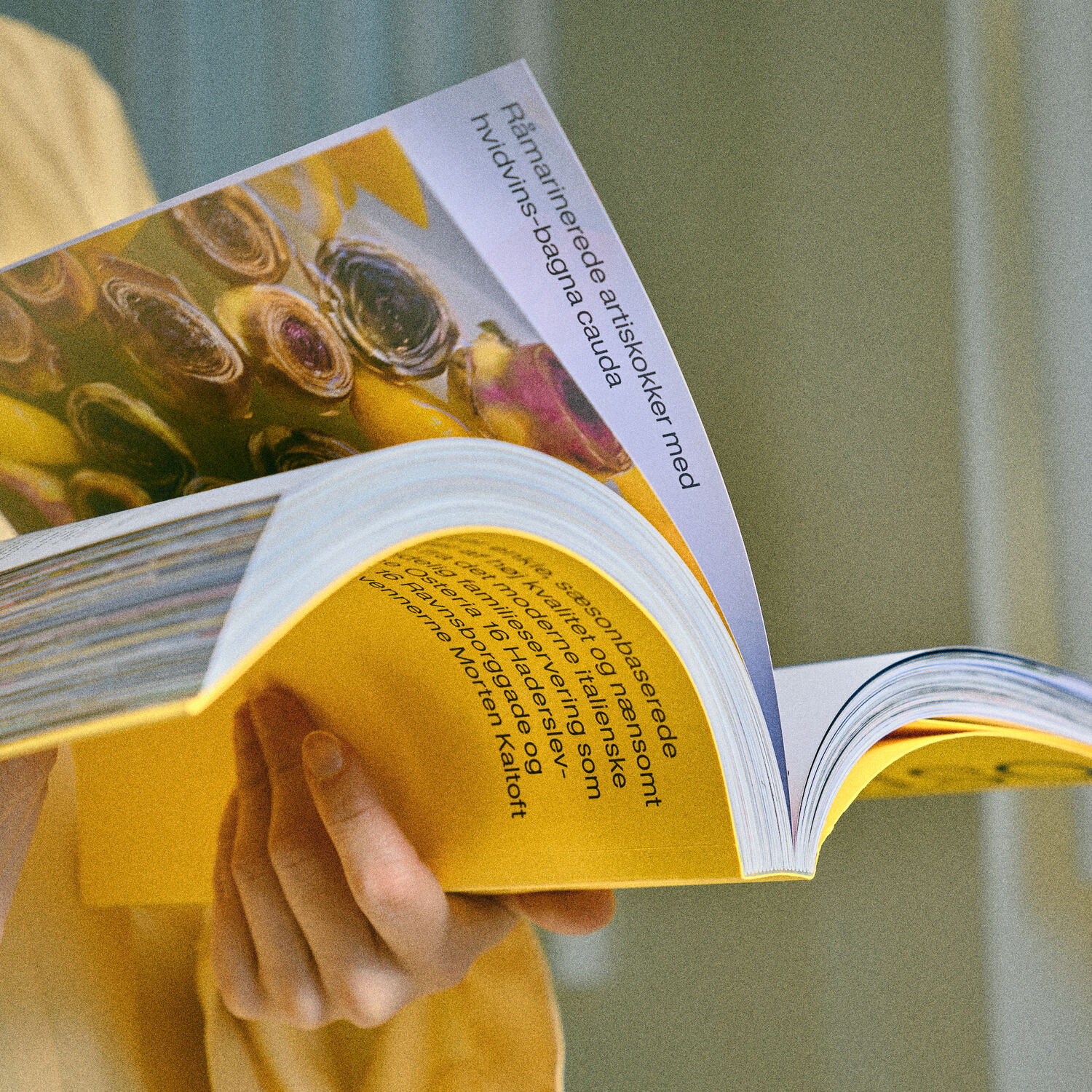
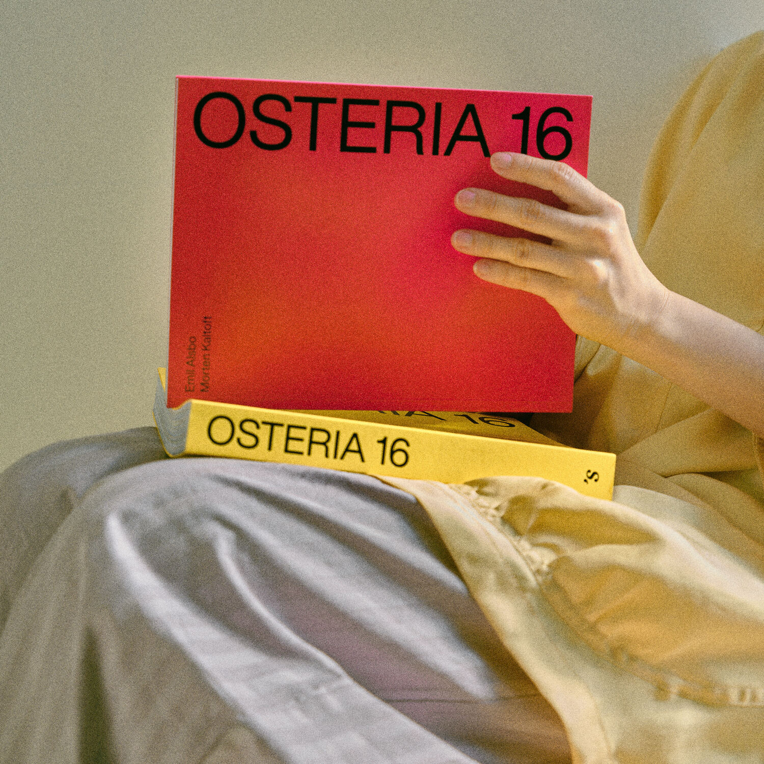
Going beyond design conventions is even more evident in the design of the cookbook for Copenhagen restaurant Osteria 166 (published by Strandberg Publishing 2020) , founded by Morten Kaltoft (a chef whose work has been recognized with a Michelin star), and photographer Emil Alsbo. During the presentation of the album, Jakob triumphantly states that this is the only cookbook without a photo of food on the cover. That's a fact - its design is extremely minimalist: the names of the restaurant's creators are placed in the upper left corner, the place name itself turned 90 degrees and enlarged to fill the entire height of the book. No figurative elements. The third visual element is the color itself.
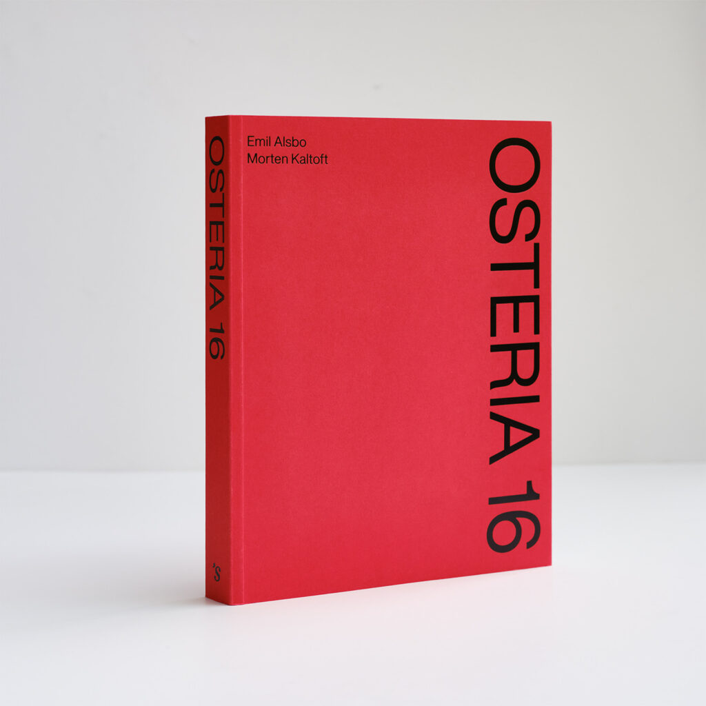
The idea to fill the cover with a swath of red came from the red linen tablecloths on the tables, characteristic of the restaurant's interior design. When asked whether they prepared alternative versions when presenting the book cover concept to the client, Jakob denies with a swagger. It was a radical decision.
He stresses that the role of the designer is both to see the possibilities,
and to be able to identify the most suitable one.
It's a combination of knowledge and intuition. The designer must be
convinced of the validity of his solution,
and the client must trust the designer.
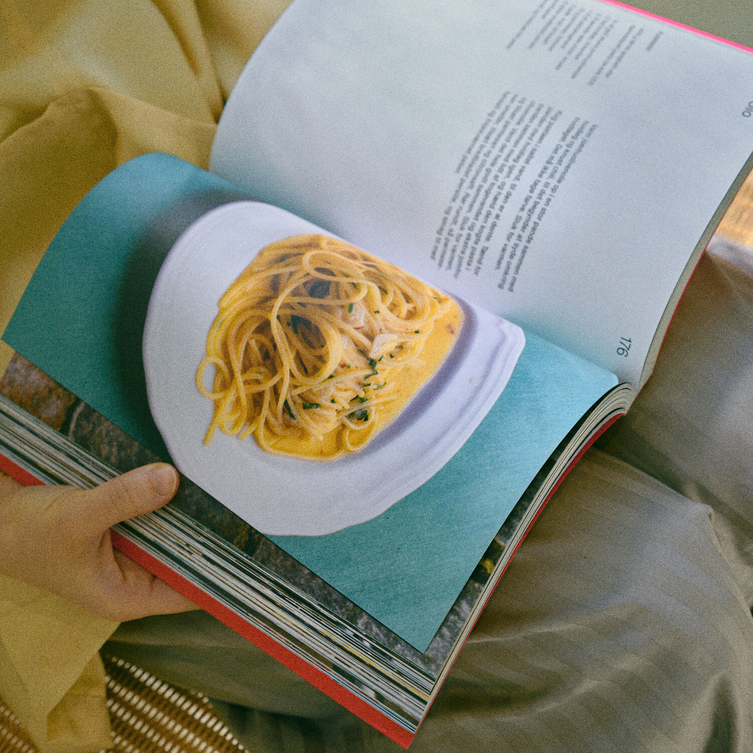
The final book was published in two versions - with a red cover and a yellow cover. The categorical iconoclasm and rejection in the Spine Studio concept of any image on the cover, was softened. Foiled copies had a photo of one of the dishes inserted loosely. The Osteria 16 book went viral and dominated Danish social media for a while. In 2024, Italian cuisine enthusiasts could enjoy the second part of the publication and another portion of recipes for "80 simple Italian dishes based on quality ingredients."
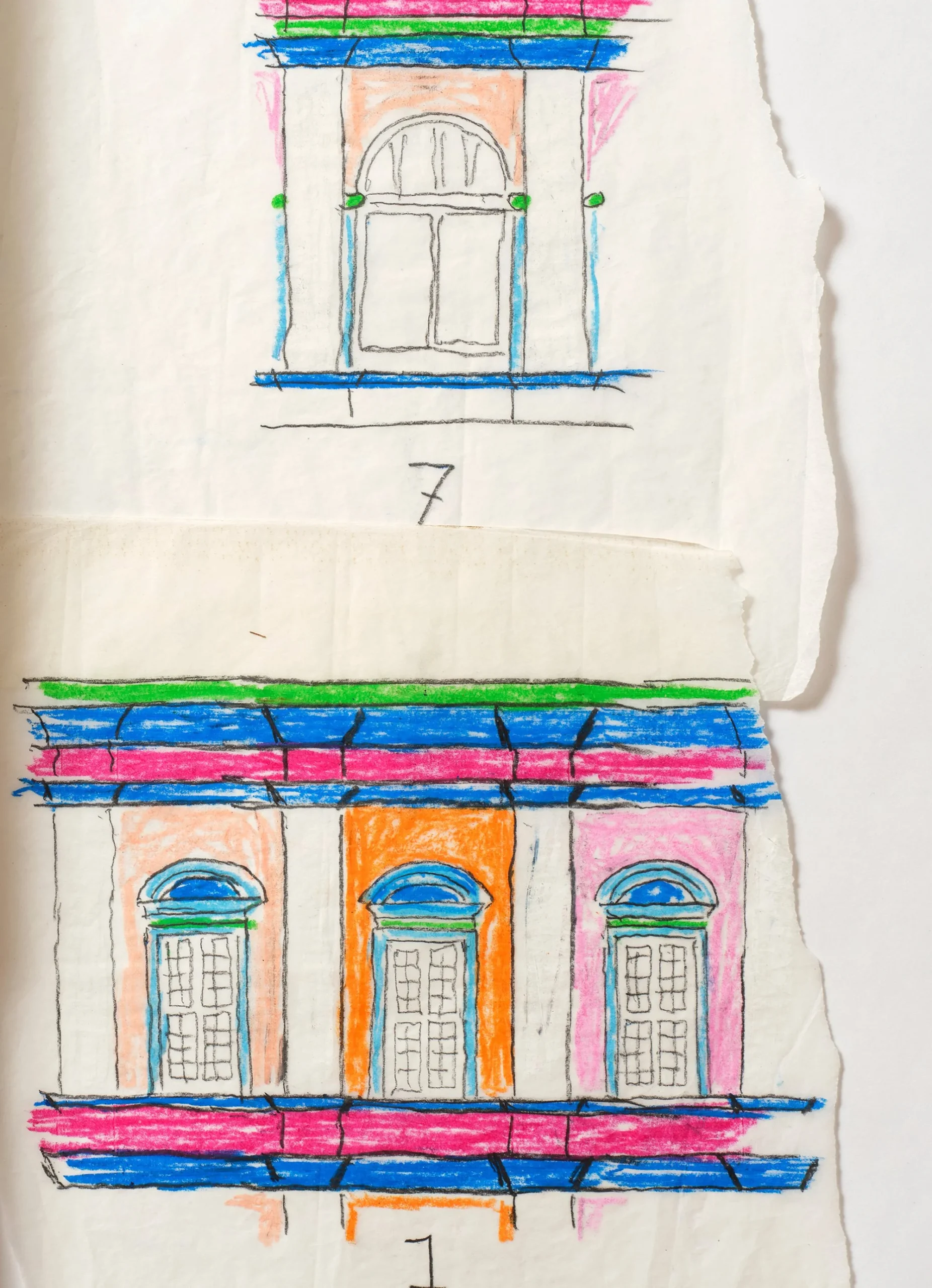
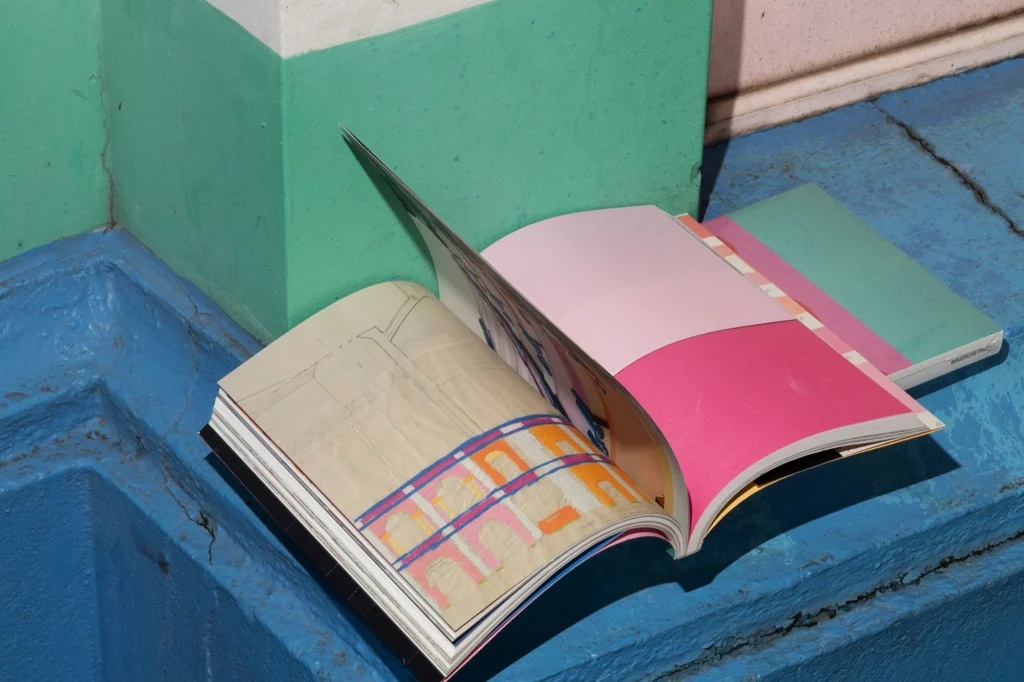
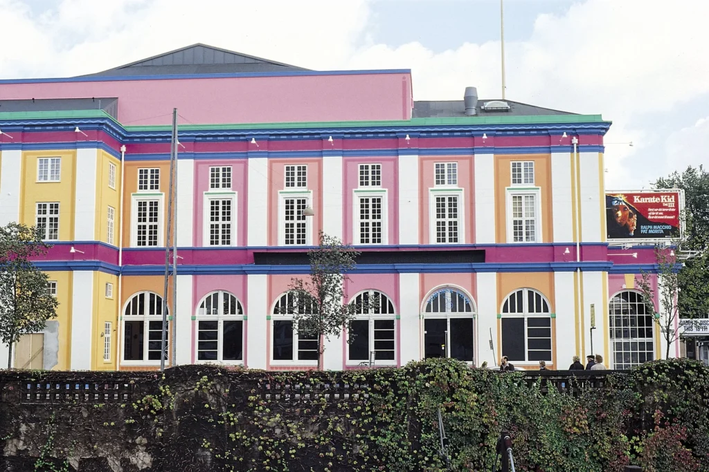
In the next book on display, Jakob and Finn revisit the concept of the radical cover. After all, it is hard to imagine a more extreme design than depriving a book's cover of any typographical elements, and thus of basic information about both its title and author. In book design, such a Heideggerian procedure of concealing and revealing is customarily achieved by means of a wrapper. In the case of the book "Palads"7 (published by Marrow Press 2024), on the cover we see only an abstract geometric composition: red circles against a background of pink and turquoise applique.
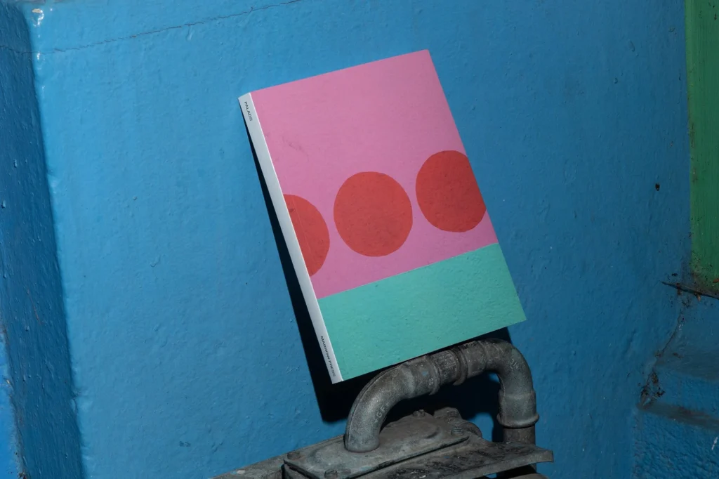
What to a reader outside Danish culture
appears to be pure form,
to a resident of Copenhagen becomes a sign.
He refers to the neo-Baroque Palads cinema building built in 1918 - now an architectural symbol of the city. Finn explains: "This building is so iconic that there was no need to put any text on the cover. People immediately recognize it. That's the power of symbols. They communicate without words." Palads' symbol status, however, did not gain immediate recognition. In the late 1980s, Poul Gernes was asked to consult on a new color scheme for the facade, and he and his team came up with a custom palette. The building's neutral white was replaced with an array of pastel tones of mint, pinks, yellows and cobalt, which were presented to the city's residents after weeks of work behind covered scaffolding, reminiscent of Christo and Jeanne-Claude's installations.
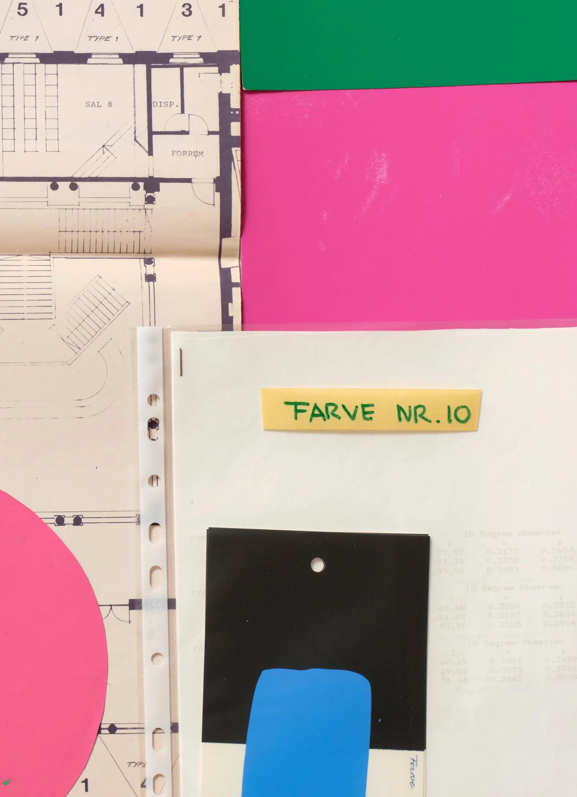
Gernes' introduction of vivid and bright colors into Copenhagen's then monochromatic landscape provoked extreme reactions. It is to them that this hybrid book is dedicated. It is a collection of critical essays, each composed in a different typeface. On the other, a photo album, a scrapbook sketchbook and a collection of newspaper clippings, concept sketches and color swatches. The book can also be viewed as if it were a stop-motion animation - one chapter presents a series of drone shots over a building on 120 pages. A quick flip through turns the static image into a movie.
The idea for the book project came about by accident: during a visit by the architect's daughter to Spine Studio, when it became clear that no proposal could gain her approval, Aase Gernes asked to start from scratch and dump the entire contents of her father's sketch box on the floor. And voilà! The chaotic collage became the inspiration for the entire publication.
I was moved by Jakob's remarkable comment about this,
that each book has its own unique heartbeat rhythm.
Rhythm precisely. In the case of Palads, instead of baroque harmony
and linear composition,
atonal music, at times even with elements of cacophony, turned out to be more authentic.
The book is extremely flexible. Its soft cover allows the publication to be rolled up just as one rolls up a daily newspaper on the way to work, or home. Most Copenhageners then pass the Palads located in the heart of the city. In defense of his concept, Poul Gernes has been outspoken about wanting the colors of the Palads - like the Tivoli gardens with their famous carousels - to be a catalyst for joy. "Tivolization" and then "Paladsification" of Copenhagen turned out to be quite the right thing to do. In the Happy City Index 2025 report8, it earned the status of Europe's happiest city.
If the measure of passion is that it lends itself to it, Spine Studio's fascination with book design meant that by the end of my visit, I couldn't wait to sit down for my own project. It came soon after, and I began conceptual work by listening carefully to the rhythm of the book. And for this lesson in attentiveness I thank Jakob and Finn very much.
Footnotes:
- https://marrow-press.com/about ︎
- https://strandbergpublishing.dk/boger/inuuteq-storch-rise-of-the-sunken-sun/ ↩︎
- https://www.mplusb.eu/project/rise-of-the-sunken-sun/ ↩︎
- https://www.boghaandvaerk.dk/pages/arets-bedste-bogarbejde-ny?fbclid=PAZXh0bgNhZW0CMTEAAac1At_n3kYmW2KAX5BLaYsyqKwOxS2kTcyXcF9OY5I52BR__yUJpJ6Xn-DPkA_aem_3BdIqo6ki1BvORvGg8Wvbg ↩︎
- https://ecal-typefaces.ch/typeface/neureal/ ↩︎
- https://osteria16.dk/ ↩︎
- https://marrow-press.com/publications/PALADS ↩︎
- https://happy-city-index.com ↩︎