Is It Worth Studying Manga and Anime? — A Free PJAIT Webinar PJAIT July 16
Author of the article: Dr. Monika Marek-Łucka.
From March 9–11, 2026, at the invitation of Prof. Ewa Satalecka, dean of the Faculty of New Media Arts atPJAIT Warsaw, we hosted José Scaglione and Patrycja Walczak from the TypeTogether studio. Their visit was part of a program that also included stops in Poznań (UAP) and Gdańsk (PJAIT). The accompanying events were curated by Dr. Monika Marek-Łucka and Dr. Jan Diehl-Michałowski.
TypeTogether is a design studio founded by two graduates of the University of Reading, José Scaglione and Veronika Burian, who, after returning from the UK, decided to continue working together remotely. What is now standard in post-pandemic work culture was, in 2006, a revolutionary business model utilizing relatively simple online communication tools. The innovative nature of this design approach was recognized in the Polish typographic community by Ewa Satalecka, who in 2010 invited TypeTogether to lead workshops in Cieszyn, and also published an interview with José Scaglione and Veronika Burian in the design quarterly “2+3D”, edited by Jacek Mrowczyk (No. 35/2010). Over time, the TypeTogether design team grew and expanded across the ocean; after 20 years in the market, it comprises 14 people in the core team and several dozen collaborators in a network of designers working on various projects. An exception to the remote work model are TypeTogether’s annual full-time , which allow typographic discussions to take place in a space of closeness and physicality (celebrating shared dinners is an essential element of team building).
TypeTogether’s three-day stay in Warsaw was incredibly intense. The mornings were devoted to studio visits. José Scaglione and Patrycja Walczak visited, among others, Mama Studio, BNA, We3, We Design, as well as the design studio at the Academy of Fine Arts in Warsaw, led by Aleksandra Stępień. They also met with Ms. Maria Clara Vidal, representing the Argentine Embassy.
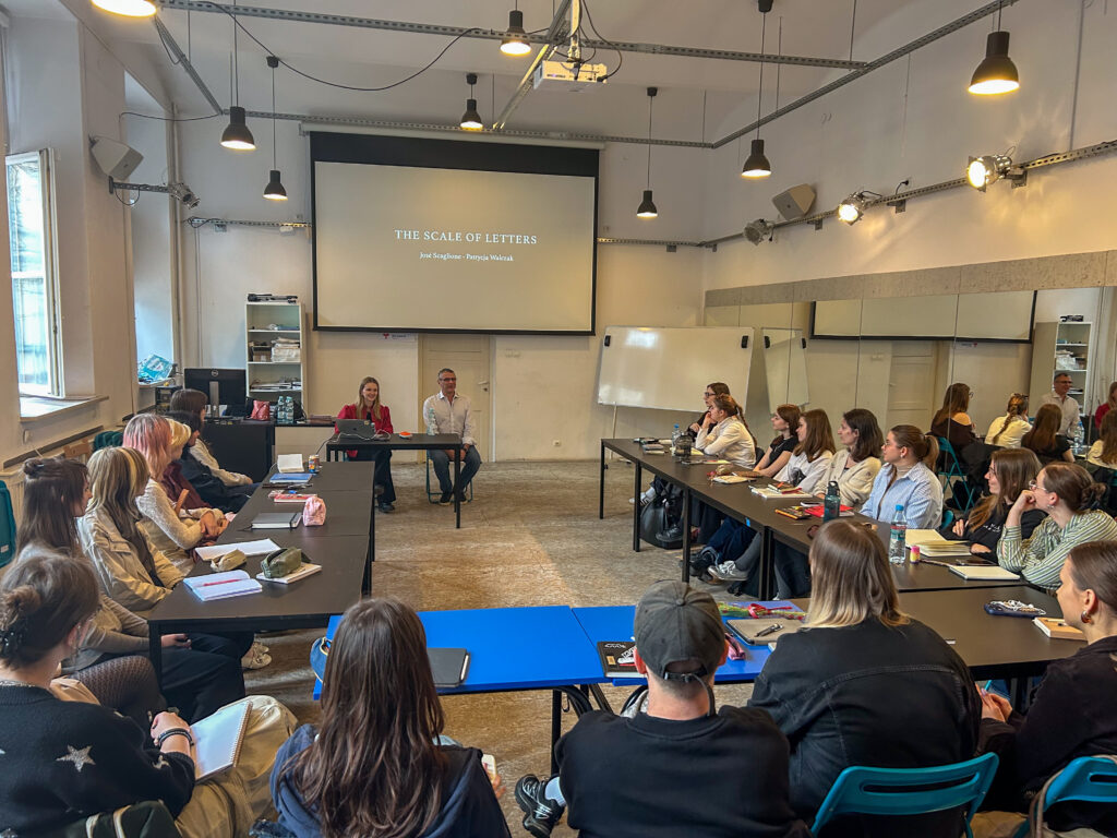
PJAIT students PJAIT the opportunity to participate in the “The Scale of Letters” masterclass, during which José explained how the characteristics of typefaces suggest to designers how to use them: slightly exaggerated serifs make a typeface ideal for footnotes, while narrow letters with high contrast and unconventional shapes come into their own at large sizes and in headlines. José also introduced the younger generation of designers to the history of typographic technology, from Gutenberg’s movable type to the pantograph, linotype, and phototypesetting, highlighting their influence on typeface design. A key part of the lecture was the issue of legibility, which in typographic terminology is divided into two concepts— : one concerning the comprehension of text based on the recognition of letterforms (legibility), and the other placing reading within the broader context of the psychological experience and the comfort of reading the text itself (readability).
José compares the process of reading to hiking up a mountain rather than taking a cable car to the summit, which doesn’t allow you to stop at any moment, return to a specific passage, or adjust your pace. His vast experience as a teacher was evident not only in his recommendations of key books on typography—José particularly recommended Gerard Unger’s *While You’re Reading*, “The Nymph And The Grotto” by James Moseley, or “Digital Typography” by Donald Knuth—but also in the discussion with students that concluded the meeting. With great seriousness and patience, José addressed every question, advising students to dare to venture beyond familiar and safe typographic solutions in their design work. Every typeface speaks a specific language. It is therefore worth trying, from time to time, to work with a typeface that is completely unfamiliar to you, discovering its limitations and possibilities. The identity of a given typeface is shaped not only by its designer’s intentions but also by the typographer’s creativity.
For a wider audience, an open lecture titled “The Power of Type” was organized. The auditorium, filled to capacity, allowed the assembled guests to enjoy the visionary thinking of TypeTogether for over an hour and a half. At the beginning, José Scaglione presented two of the latest projects—Futura 100 and Primarium. The first involves expanding Paul Renner’s original 1927 design to include 23 writing systems, including Arabic, Bengali, Greek, and Tamil. The copyrights were licensed to TypeTogether by the Bauer company in Frankfurt, where the original Futura typefaces were cast. As José Scaglione noted, Futura was a typographic phenomenon of the 20th century, a synonym for modernity and a promise of pushing boundaries. Futura was chosen as the typeface for the visual communication of the Apollo 11 mission. But although it flew to the moon, representing the inhabitants of the blue planet, until 2025 it could practically only support languages transcribed in the Latin script. In the context of the postcolonial turn, which also applies to typography, the Futura 100 family becomes a viable solution for inclusivity—both in access to cultural heritage and in the digital representation of users of non-Latin languages. The second project José mentioned is the result of over two years of research on early childhood writing education in the Latin script across more than 40 countries. The result of the work by a team of experts—including both theorists and type designers—is the Playwrite cursive typeface with country-specific variants, as well as a rich knowledge repository (www.primarium.info), which can be utilized by institutions advocating for systemic changes in education. It is worth noting that the typeface was awarded a certificate of typographic excellence at the 71st Type Directors Club Annual Competition.
Later in her lecture, Patrycja Walczak spoke about the Poltik typeface project, which she carried out in collaboration with TypeTogether as part of the Gerald Unger Scholarship. The story behind Poltik shows, on the one hand, that inspiration for an observant designer can be found in an ordinary drawer—in Patrycja Walczak’s case, it was her grandfather’s 1970s alarm clock with unusual numerals on the face. But it also serves as a reminder of positive changes in the approach to intellectual and artistic property in Poland. Fruitless efforts to find the name of the designer of the numerals’ shape, even in the archives of the company that produced the watch model in question, revealed how design authorship was systematically overlooked by the authorities of the Polish People’s Republic—things “just got done.” In this context, it is worth mentioning Karol Śliwka, who saw signing his name to a design as taking responsibility for its form, even if it meant signing a jam label design. Poltik is a nostalgic look at the organic-psychedelic forms defining the design of the second half of the Polish People’s Republic. The Poltik Display variant presents a challenge for the typographer and the promise of satisfaction that comes with bold design. Patrycja Walczak, in addition to her collaboration with TypeTogether, is a lecturer at the University of Arts in Poznań and teaches typeface design.
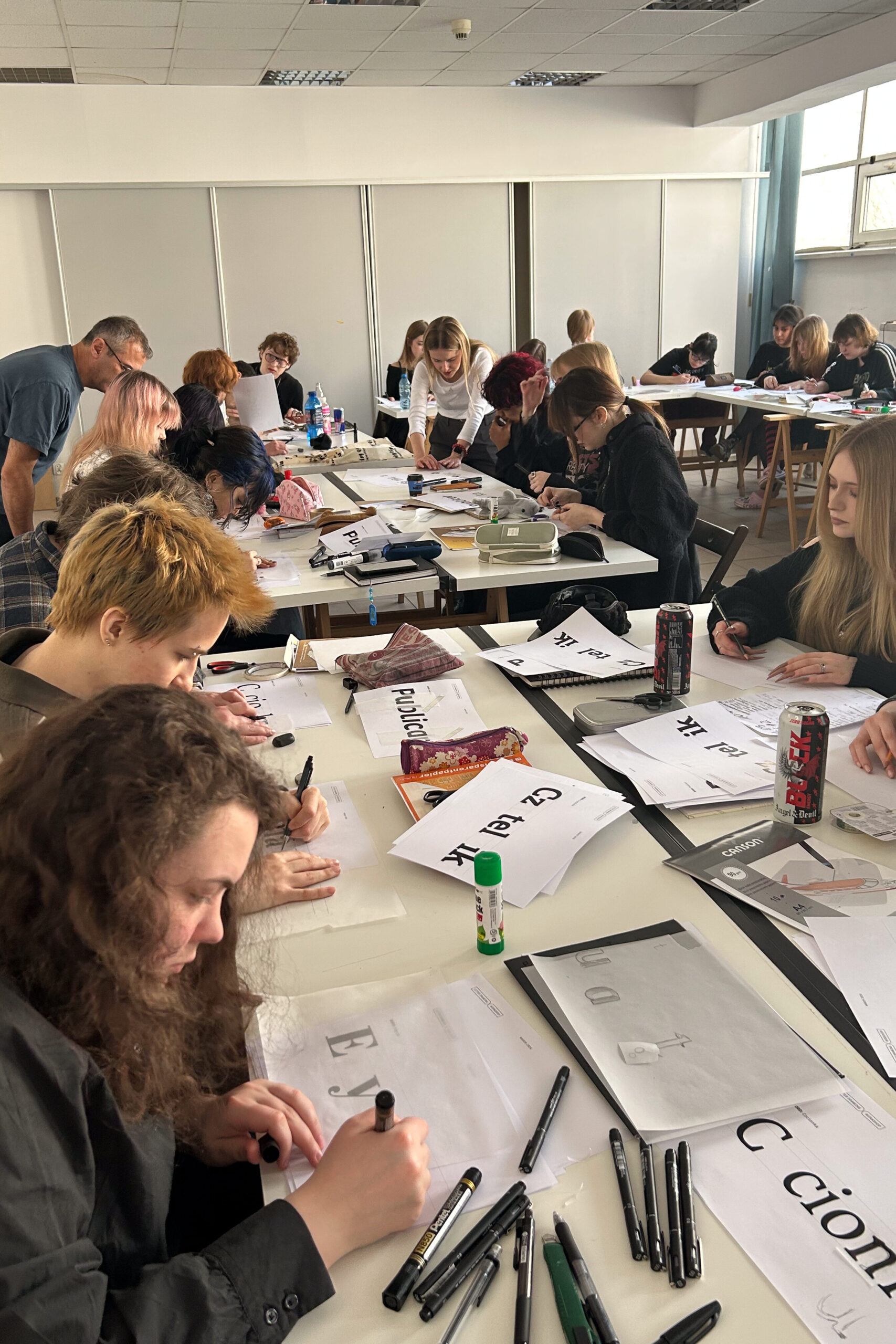
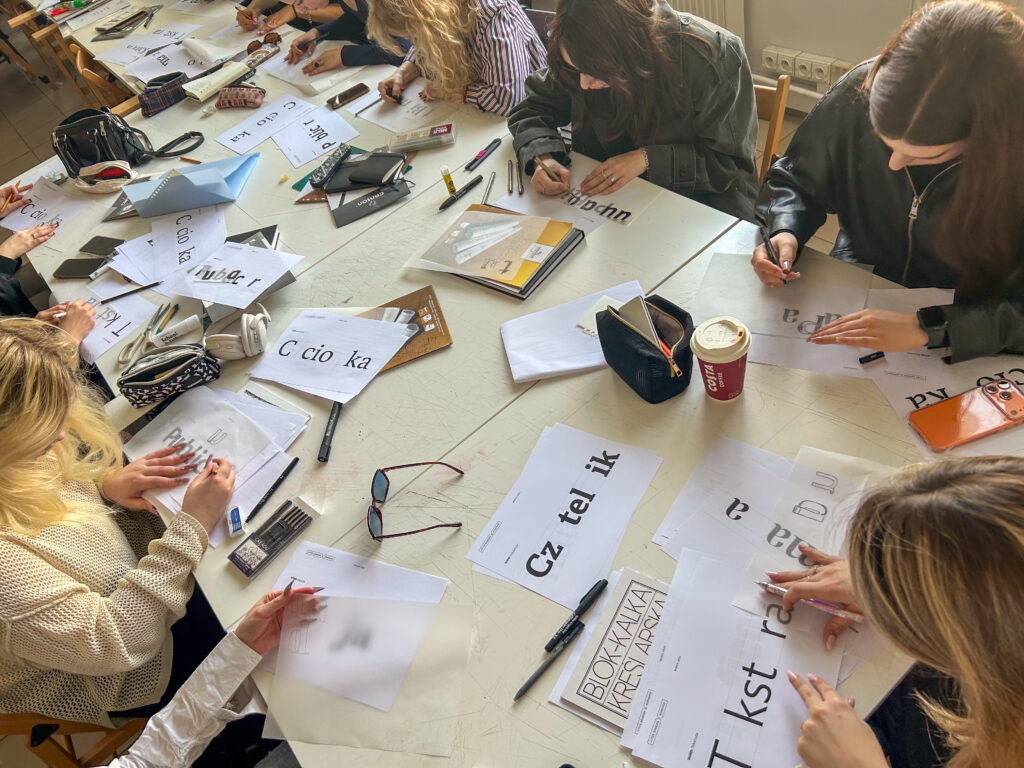
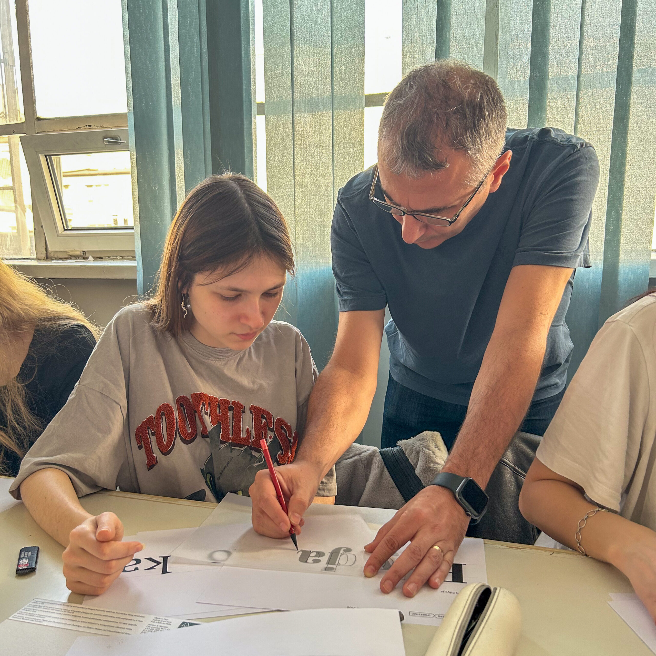
The final event of TypeTogether’s visit to Warsaw was a workshop for first-year students in the Graphic Design and Multimedia Arts program. José Scaglione and Patrycja Walczak led an introductory workshop on type design, which involved drawing missing letters in words set in various typefaces. The class was conducted entirely by hand, with students working on tracing paper, searching for clues about the missing letter among the surrounding characters.
When asked about his favorite book on typography, José cited Edward Catich’s *Origin of the Serif: Brush Writings and Roman Letters*, praising its literary merits. For Patrycja Walczak, it is Robert Bringhurst’s “The Typographic Primer,” a source of delightful comparisons and ironic commentary. Apparently, the world of typography is divided into followers of Catich and Bringhurst. José and Patrycja, though different in this regard as well as in terms of professional experience and cultural context, demonstrated through their collaborative effort—“typetogethering”—what the power of typography, as the title of their lecture suggests, truly entails. Typefaces are based on, as José Scaglione puts it, “collective visual memory”—they remind us of what we share, serve as tools for building dialogue and demanding a voice for those systematically silenced, and ultimately provide a space for creative expression.
Another opportunity to explore the work of TypeTogether—the Primarium project and the Playwrite and Ploquine typefaces—will be the 71st Type Directors Club Annual Winners Exhibition, which is scheduled to open on April 18, 2026, at 4:00 p.m. at the Museum of Modern Art in Warsaw. The event will be accompanied by a lecture by the exhibition curator and TDC Archive, Dr. Monika Marek-Łucka, on the history of the TDC; a presentation by Marian Misiak and Pola Małaczewska on their work on the TDC Annual Typography 46 project; as well as a panel discussion featuring Prof. Ewa Satalecka (PJAIT Warsaw), Prof. Mateusz Machalski (Academy of Fine Arts in Warsaw), Dr. Ania Wieluńska (Academy of Fine Arts in Warsaw), Dr. Ada Pawlikowska (Academy of Fine Arts in Gdańsk), Dr. Joanna Tyborowska (Academy of Fine Arts in Kraków), Marian Misiak (Three Dots Type/Slanted), Pola Małaczewska (Three Dots Type/Slanted), and Dr. Monika Marek-Łucka (PJAIT ). The interview with José Scaglione and Patrycja Walczak is available on YouTube:
Author of the article: Dr. Monika Marek-Łucka.