69th TDC Annual Competition Winner
On making a (visual) difference.
Interview with YiFei Hu,
designer of Gracemoon Scented Tea packaging.
by Aleksandra Czarniak, Dominika Nowak, Agnieszka Wacławik & Anna Makowska
(May 2024)
What was the initial spark (or inspiration) behind the concept of the GraceMoon Scented Tea Series?
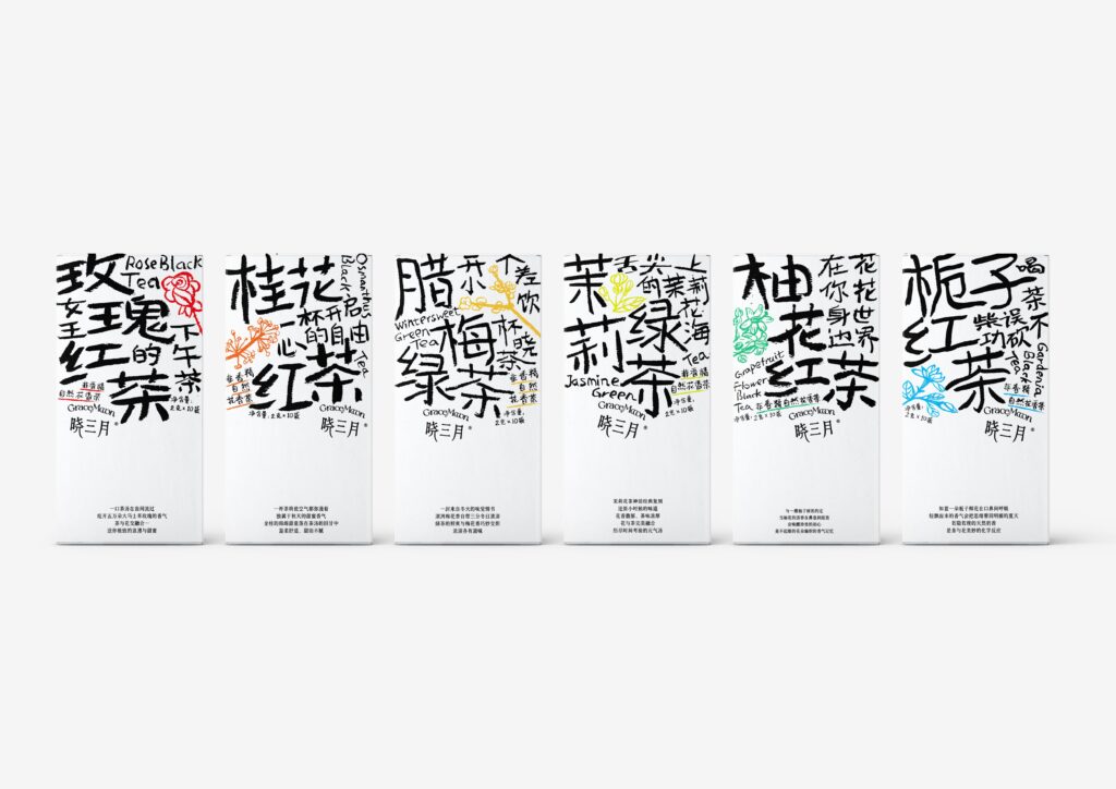
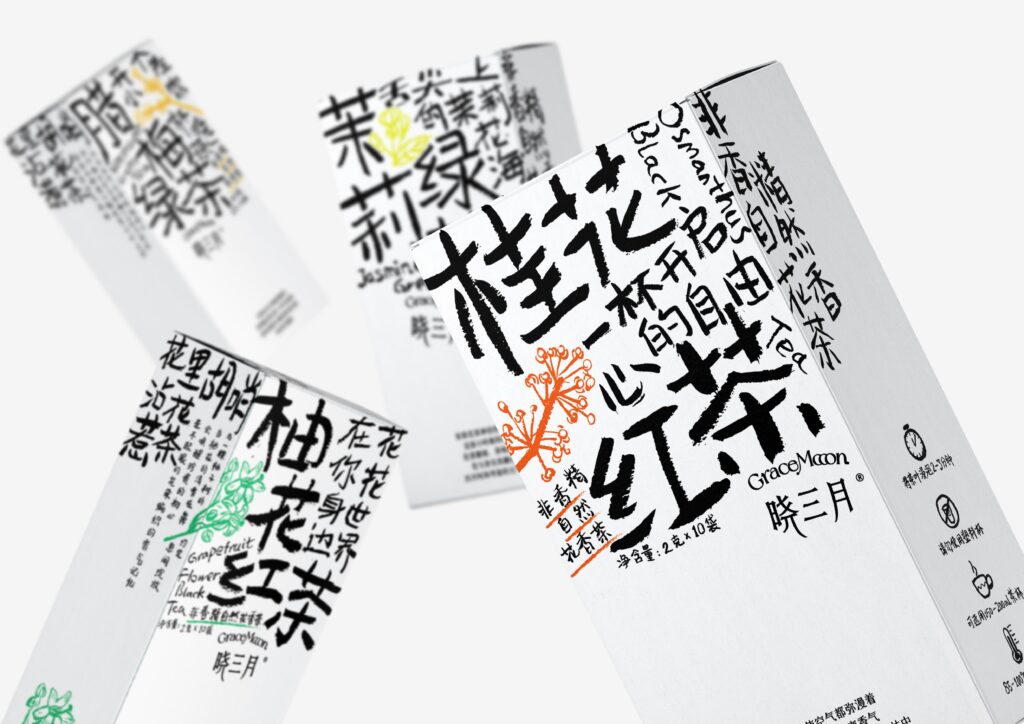
In recent years, trendy and youthful tea packaging has become really popular in China, and the market is full of beautiful, delicate designs. But I think if I create „exquisite” packaging for the Gracemoon Scented Tea Series, it will just get lost among all the others. So, I feel Gracemoon needs something that really stands out, and that’s where the idea of „ugly” and „rough” packaging came from.
Could you let us know what’s written on the packages?
Actually, what’s written on the packaging is the name of each tea, along with a phrase that describes it, plus the product specifications and net contents. I figured the largest text should directly tell consumers what kind of tea it is, so they can get the information they need quickly. I chose this approach because a lot of teas on the Chinese market have names that don’t really explain the tea itself, which can make it harder for consumers to understand what they’re buying.
What challenges did you face in integrating typography into packaging design, and how did you overcome them?
Good question! I actually ran into some challenges. As I mentioned earlier, I wanted the tea packaging to look „ugly” and „rough.” We all know that beautifully designed words can easily turn into nice layouts, but these ugly words made it hard to arrange them. After a lot of experimenting and combining different options, I was pleasantly surprised to find that when the words were randomly stacked in the upper space of the boxes, it created a strong visual contrast with the lower space. This not only made the design unique but also ended up looking quite appealing.
Your Gracemoon Scented Tea Series is quite different from your previous design, “Happy Birthday.” That one had a lot more variety, while the tea packaging is much simpler. Why did you decide to go in that direction?
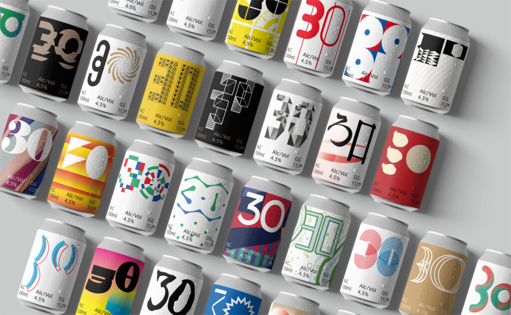
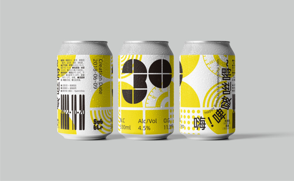
„Happy Birthday” is actually a birthday gift for myself and also a collection of my works. It brings together 30 design projects from the past 5 years, so you’ll see a lot of different visuals in it. The Gracemoon Scented Tea Series is just one of those 30 projects (the one with the rough handwritten „30”). The final look of a design depends on what the project needs to convey, and for Gracemoon, a simpler visual style best captures the essence of the project.
How did you make sure your typographic designs connected with the tea package’s target audience, and who exactly was that audience?
Actually, the original idea was to make this tea packaging stand out in the market with a unique visual style to attract consumers. Later, we discovered that our target audience was mostly working professionals and students. They associated this series of packaging with the word „relaxation,” believing that the product and its visual style could help relieve their anxiety and stress.
How do you think typographic design can impact how consumers perceive a product and their buying decisions?
Firstly, being personalized or unique can grab the attention of customers or target consumers. Secondly, clearly expressing the product’s content helps customers understand what they’re buying. Thirdly, the typography should be legible and easy to read, making it comfortable for consumers to see at a glance. Finally, a touch of creativity can make the design more appealing to consumers.
What advice would you give to fellow designers who want to explore unconventional approaches to product packaging and sensory branding?
If your client gives you plenty of freedom, feel free to explore and create in the way you want. Just make sure that your creations help consumers better understand and buy the products through the innovative visuals you use. In short, your design should always focus on serving the client and expressing their products effectively.
The material has been created as part of the Spring 2024 Semester assignment for the Elements of Visual Communication Theory (EVCT) course, conducted by Dr. Monika Marek-Łucka at the Polish-Japanese Academy of IT in Warsaw. We would like to express our gratitude to the designers awarded at the TDC Annual Competition for contributing to the creation of high-quality educational materials.
Illustrations source: https://www.oneclub.org/awards/tdcawards/-award/46335/gracemoon-scented-tea-series & https://www.oneclub.org/awards/tdcawards/-award/46336/happy-birthday

