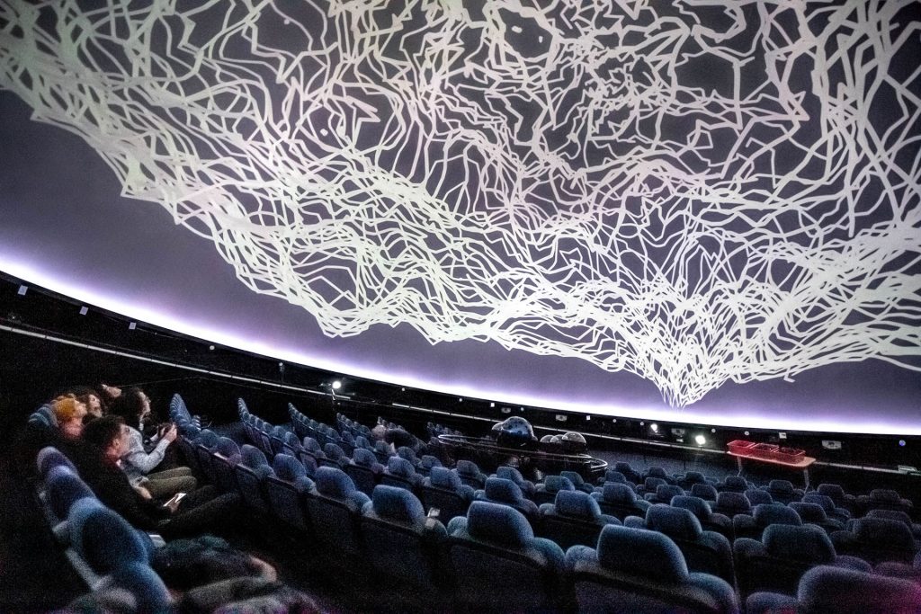
69th TDC Annual Competition Winner
The more unique the shapes of the surroundings,
the more unique the lettering.
Interview with Rajshree Saraf,
designer of the Typespace App.
by Anna Oleś, Natalia Prus, Julia Miszczak & Piotr Zapaśnik.
(May 2024)
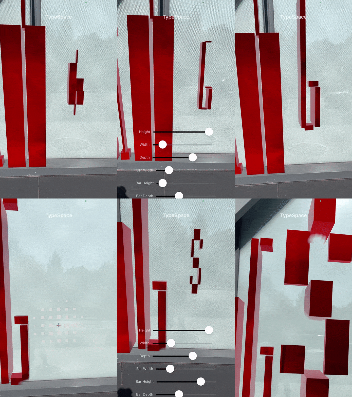
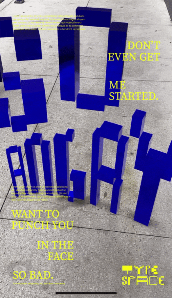
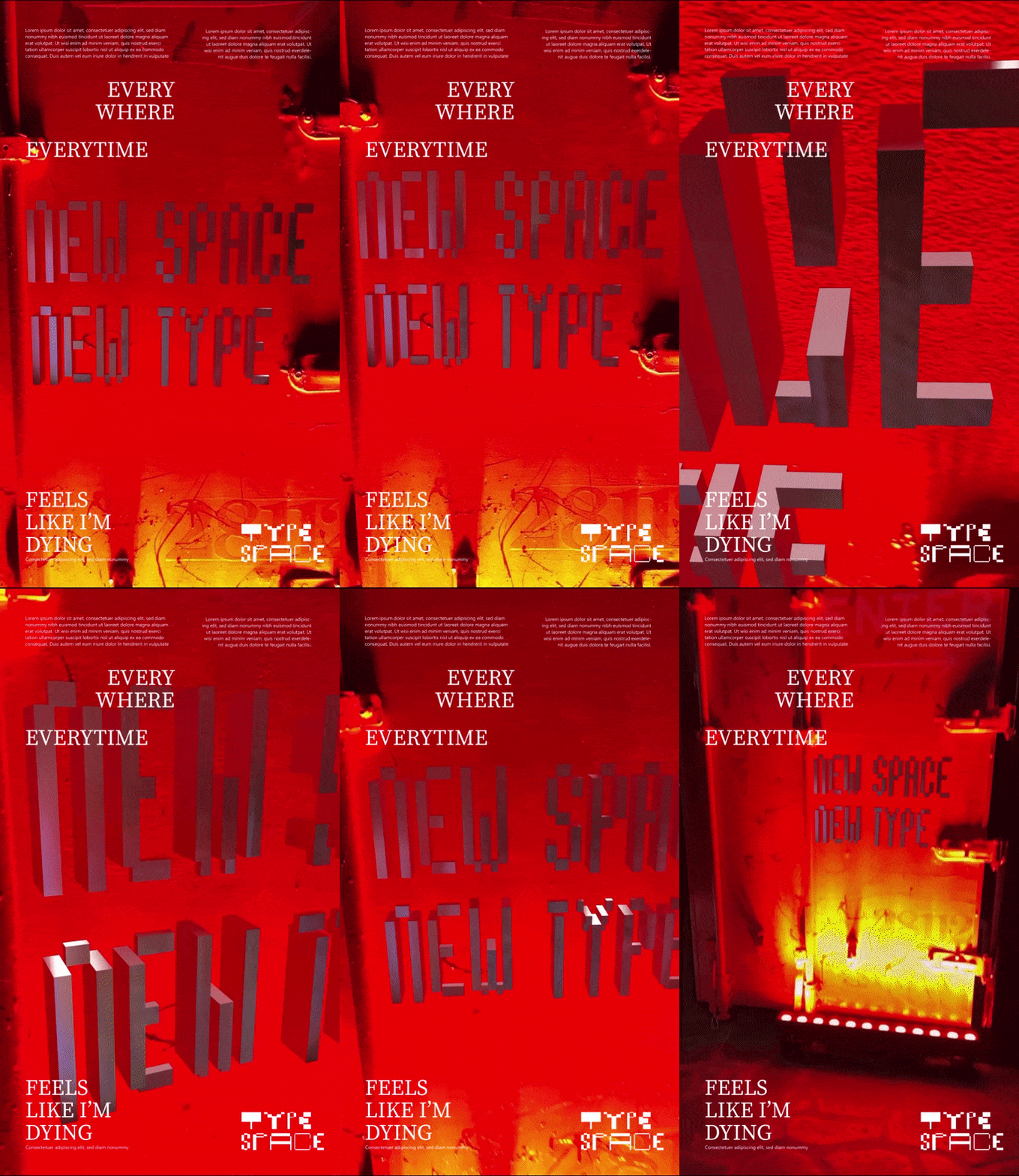
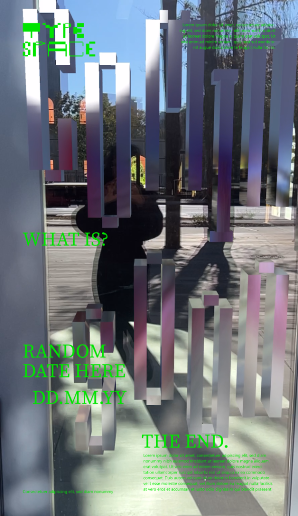
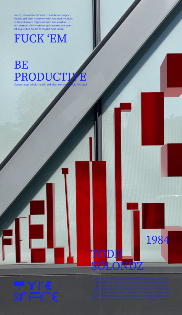
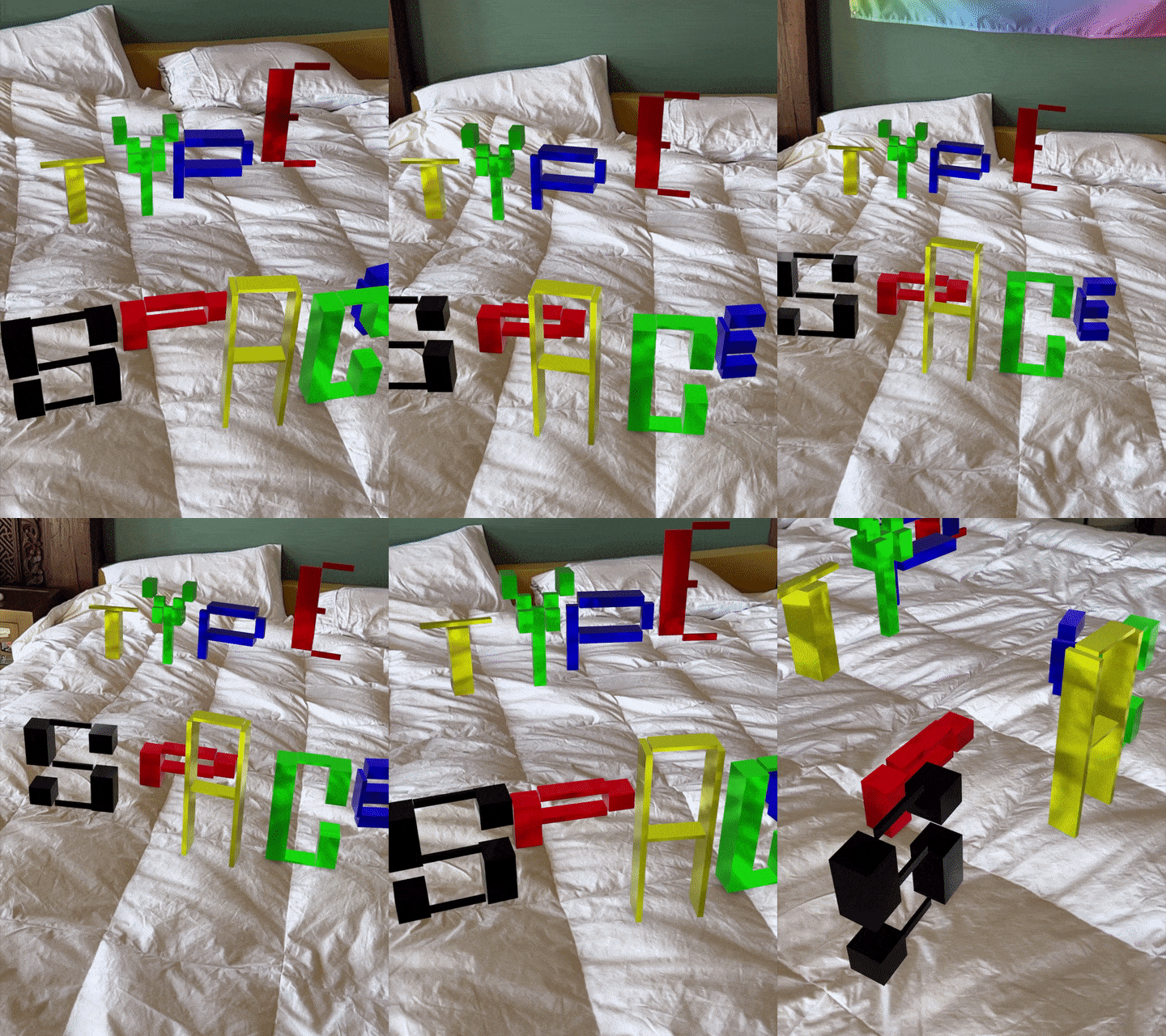
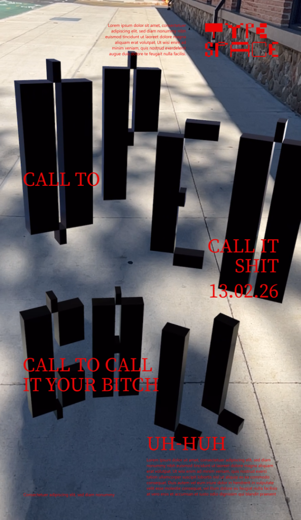
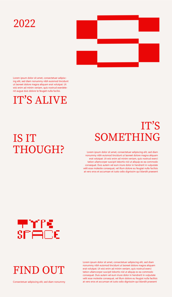
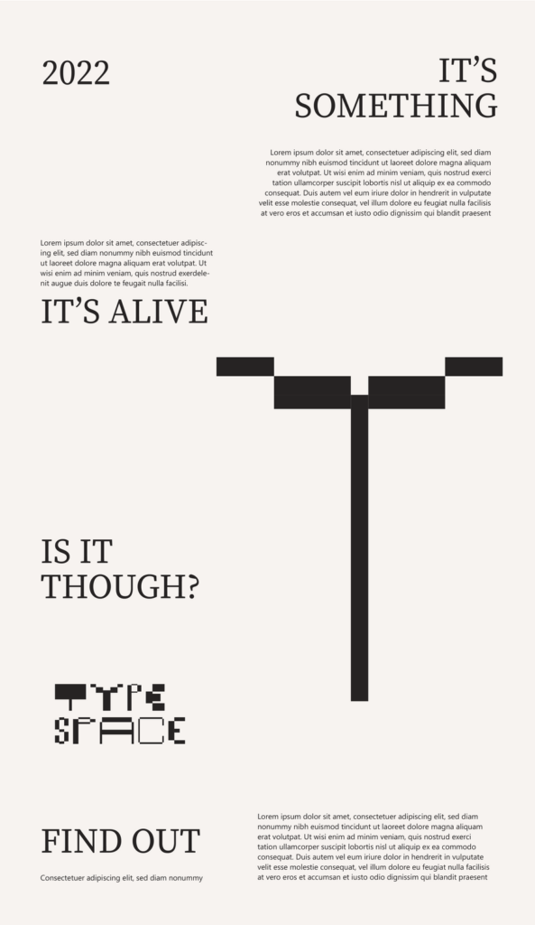
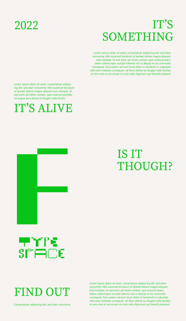
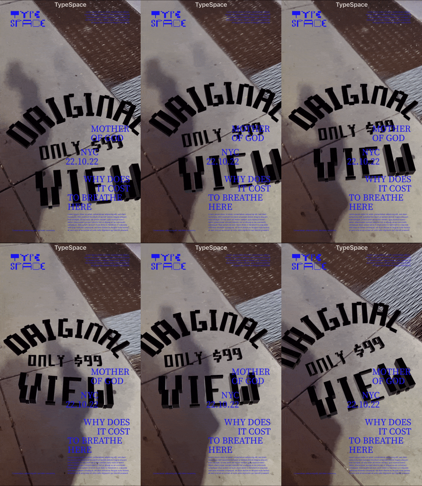
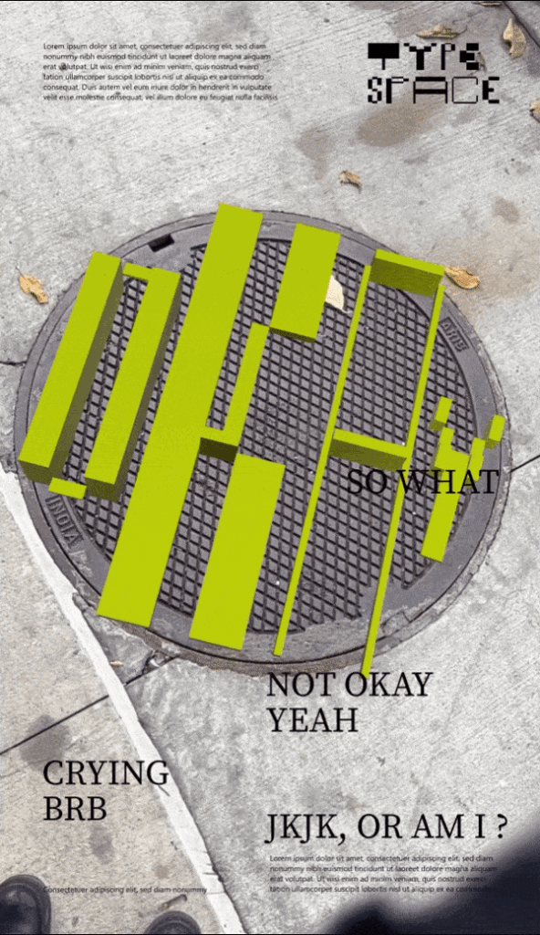
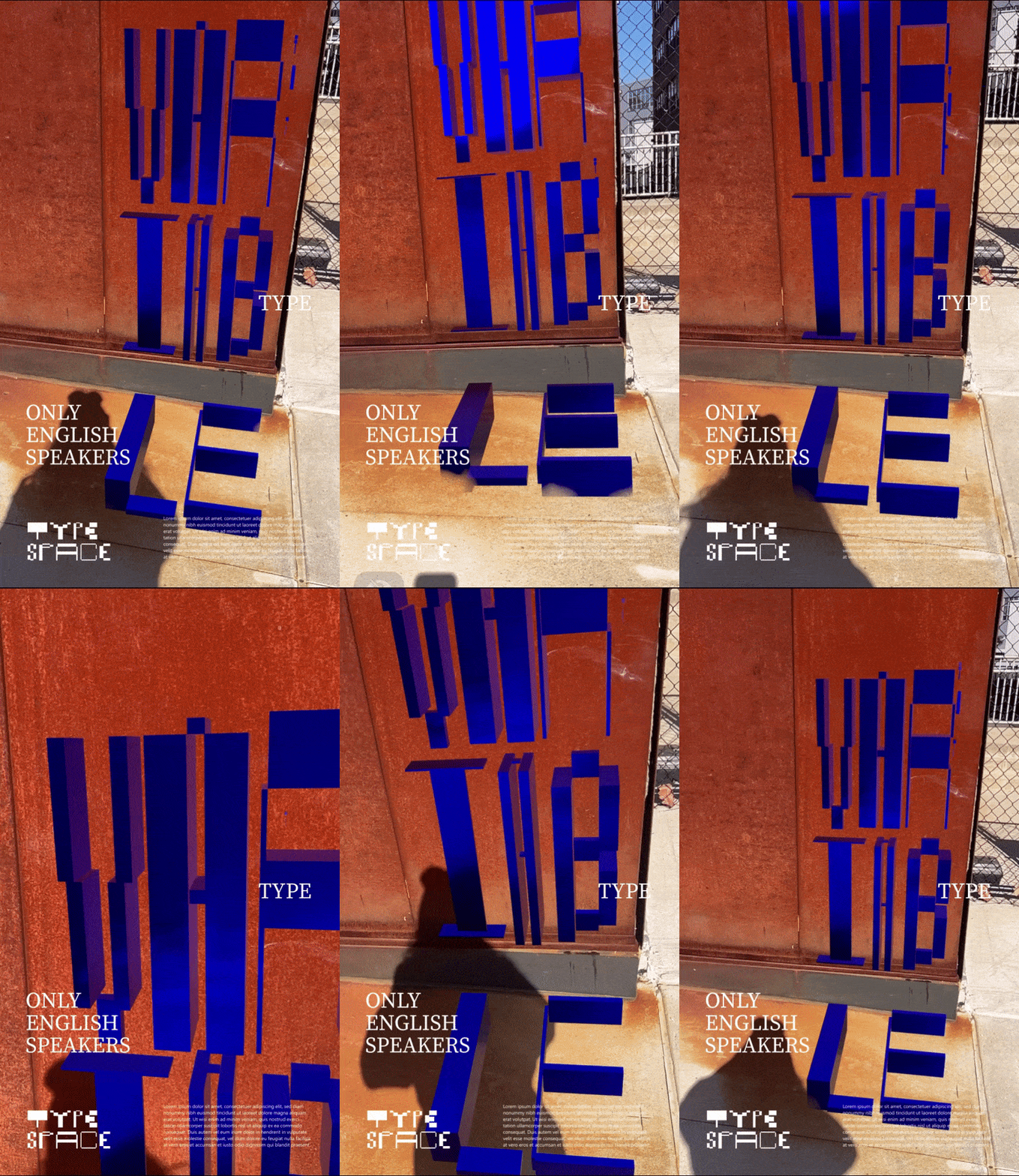
The Typespace project is a 3D variable typeface designed specifically for Augmented Reality. It lets people place variable AR typefaces in real-world environments and tweak the font in real time to suit the space. AR is still a relatively new phenomenon, but it’s gaining more popularity these days. Where does your interest in modern technologies like VR and AR come from?
My undergrad background was in design, but I wanted to explore something that combines science with art. So, for my master’s program, I decided to combine different forms of art with various kinds of tech. It’s not just modern tech—it’s even old tech and all forms of art, whether it’s writing, music, design, or whatever. I went into it wanting to explore all kinds of technology. AR really stood out for me, even though I was initially apprehensive about it. I thought, who would want to look at things through their phone in real life? But when I started creating with it, I realized it’s actually similar to print design, which I love. It lets you see your creation live. While it’s not as tactile, it still brings that same joy—at least it did for me. That’s why I stuck with AR. It ties into my design background and my love for typography. I don’t know why, but I just gravitate towards it. I wanted to explore typography in AR, and that led to new discoveries. I just kept going down the rabbit hole, if that makes sense.
How did you come up with the idea for this app for your diploma?
My graduation project focused on learning the rules of typography in AR. When I studied design, there were certain rules about typography and design in general. If you followed them, you could achieve the most legible output, but in AR, it wasn’t happening the same way. I wanted to explore wayfinding, which led me on a research journey into the rules of typography in Augmented Reality. While working on the project, I realized how difficult it is to have strict guidelines for typography because our environments vary so much. It would take me a long time to first design the type in Illustrator, then go to Blender, and finally test it in Augmented Reality. If something was off, I’d have to go back to the drawing board—or at least Blender—to make tweaks. It was such a lengthy process, and I thought it would be easier if I could design directly in the environment, so there would be less back and forth, and I could stay true to the space where the design would actually exist.
What aspects of the natural surroundings or reality did you consider when creating and adjusting these letters to fit into the environment?
Well, I guess it was mostly about the lighting and the amount of clutter or people in the background. My favorite thing to look for in the surroundings was different forms—not just a table, but something like a plant, to see how I could design for a non-traditional shape. That was the most fun because our surroundings are full of objects of different sizes, and they’re not all rectangular, right? I think that was my favorite part—finding unique shapes that could create more unique lettering. Then, of course, to make it legible, I had to consider things like lighting, clutter, and all that.
The Typespace project seems pretty technical and complex. Did you get any help from other specialists, or did you handle it all on your own?
I did a master’s, where I learned how to code, so it was relatively easier than getting into it newly and blindly. I worked on the entire thing by myself, but I was in a house with a really tight-knit community of Augmented Reality creators, and they were all really helpful. Even if they didn’t know how to help me with design or Xcode, they always had solutions that I could then Google and find more information about. The Augmented Reality community was extremely helpful in making this happen.
Was there a part of the creative process you enjoyed the most?
What did I enjoy more? I don’t know. It wasn’t like this or that. It was always about designing something new and then realizing that I hadn’t added a feature I needed. Then I’d switch gears to the technical side to add that feature, and while doing that, I’d discover if something was possible or not. I’d then return to design to see if that made it cooler or worse. It was a back-and-forth process, and I think that was fun. It felt like having two personalities: one asking, “Can I make this happen as a designer?” and the other, my tech brain, questioning, “Why do things again?” Then I’d have to deal with it and try really hard to make it work.
This project is really innovative and interesting, combining technology, reality, design, and art in a unique way. Since you drew a lot of inspiration from early pixel typefaces, we’re curious: how do you think switching to a more extravagant typeface might impact the project? And would it even be possible to change to a different typeface?
I think this is exactly the tech and design issue we were discussing. Initially, I wanted the typeface to be more extravagant, with a bit more character than just cubes or pixel fonts. However, I quickly realized that the technical side would be too demanding. It would slow down the whole phone and create a computational burden, making for a choppy experience. Every curve or node adds significant rendering time and uses more space, which is why it had to be cubes. I got used to it and convinced myself that it made sense for the design. I’m sure it’s possible in the near future—if anyone wants to try something new, it’s more feasible now than before, given how our tech has evolved. That’s why I made peace with it. I knew it was just an artifact of the media, like pixel fonts were because our screens couldn’t render anything else.
You mentioned you’re still working on the project and exploring various ideas and media. Do you have any specific plans for it at the moment?
Well, I’d love for more designers to use it so I can get feedback on what they need. I’ve gotten used to the app, so I know how to use it, and since it’s my app, I’m a bit more patient with it, you know. I’d love for more designers to use it and hopefully be inspired to do more with AR, but there aren’t any specific plans for it right now. I would like to create more unique fonts with it, but I think I’ll need a collaborator to see that through—so I’ll be looking for one soon.
Problem-solving is a big part of the design process. Can you tell us what obstacles you faced while working on the Typespace app?
AR was something I liked. It was a problem I wanted to solve or figure out, which I think I have. The main issue started with not knowing how to design in AR because everything’s up in the air. I realized that where we design can’t be that different from where it’s going to be. I can’t design in Blender for it to live somewhere else. When it’s so disconnected, it’s really hard to design, and that was the problem. I mean, there were so many problems. That was the first problem. The second problem, which was related, was that we don’t see our outputs in the environment. That’s why you don’t know if it’s going to be legible or how it’s going to look, so you want it to be clearer. One part of it was just experimenting. When I started the project, I thought there’s no way I’ll be able to pull it off, but I decided to try. That’s why I created a typeface that you can change and make variable based on the environment and also in real time while you’re in the area—just so that people, or designers, waste less time. I also like the accidents that happen. Blender, for example, feels so prescriptive. I don’t know how to put it. It feels like you need to have a plan for how you want the font to look before you put it in the space, and that kind of kills the joy. There’s no room to be a little more whimsical with the typography. I knew it was going to be near a plan, but it allowed me to see and experiment with different things, which I found fun.
Such a project clearly takes a lot of time, and since you’re still developing it, I’m curious—how long did it take to design what you have so far?
I think it took me about 4 or 5 months to build the core of the project, and then the next few months were spent giving it to other designers for testing and to different people to fix the UI and ensure it worked properly. So, I guess it took about 10 months in total. Now, I just add things very rarely, when I remind myself of something cool to include. So, I’m not actively changing the app that much.
You mentioned that you let designers come back with their needs and test the project with different designers. Do you think there are any specific skills a designer should have for such a collaborative project? And what should this kind of collaboration look like?
I think being open is key. I know this sounds vague, but it’s not essential to know the tech yourself. You can collaborate with people who handle the tech. What’s important is being open to what’s possible and what’s not, and adjusting your ideas based on the technology. Work closely with your more technical collaborators to understand the nuances and differences that might spark new ideas. Don’t enter the project with a rigid, pre-planned vision of how everything should look, because with so many technical pieces involved, it rarely turns out exactly as expected. So, I guess that’s it.
What have you learned from working on this project?
I genuinely learned so much because, it was completely new territory for me. I knew how to write a few lines of code but had never made an app before, and honestly, I had never even made a font before. So doing both of these new things at the same time was interesting. I was always more of a lettering person than a font creator. Learning both skills simultaneously was quite a challenge. I do think being patient is important and learning how to take breaks is crucial. Especially when you’re coding, you can get so immersed that nothing makes sense and everything keeps falling apart. The number of times I’ve gone out for a walk and had a sudden realization about what was wrong with my code, then had to rush back home to fix it, is countless. Taking a break from your project every once in a while is really helpful. I feel that.
The most obvious solutions often come to you at the strangest times.
Exactly.
Well, the brain needs to rest, but it still processes things in the background.
Just step back and take a break for a bit.
I mean, I think my biggest lesson from this project was about embracing accidents. The whole project started as just a thought. It was like an accident. I never thought about making this font. It was only when I went deeper and deeper into it that I thought, „Oh, maybe that would be nice. Oh, maybe that would be nice,” or „What if that happens?” I feel just being open is key. Even with my design, I feel I’ve become a little less rigid with what I do. Now I’m more like, „We’ll figure it out as we start working on it,” and I don’t plan too much ahead.
Which part of the creative process for the Typespace App did you find the most challenging?
I was doing a residency at that time, so my nights and days were entirely devoted to this. I couldn’t even leave the residency; I couldn’t physically give up on it because I had to submit something at the end of the residency to show what I had done. I wanted to give up at every single step. I thought, „This is too hard. There’s no way I can write a word and then change it to something else, and then do that.” I still can’t believe it. If I had to do it all over again, I don’t think I would trust myself to do it because I don’t know how I managed it. So it was all really hard, but I think being in a space that didn’t let me quit, no matter how hard it was, was helpful.
With all the buzz around AI and new technologies these days, do you think generative models and modern tech could actually benefit the design process? How might they influence how we design? It seems like you’d agree that integrating AI and new technologies into our creative work can be valuable.
Yes, and I wouldn’t even call it a part. I would think of it as a tool, like Photoshop or Illustrator, or anything else that helps you realize your vision. Don’t use it as a shortcut to get to an output. I don’t know if that makes sense. You don’t have to use AI in every project, just like you don’t have to use Photoshop in every project. You know, you change your tools based on what you need, and you should know how to use those tools to get what you want, because you already have a vision. I feel like if we start using AI as a tool rather than a shortcut to do the hard work for us—I don’t know if that makes sense—I’m not opposed to it. Just don’t abuse what it can do, because it will only produce what it knows. If you want to come up with something unique, you need to provide your own inputs. AI learns from the past; it doesn’t know things that don’t exist yet. So yes, use it as a tool, I guess.
As my last question, do you have any advice for young designers? Whether it’s about the creative process, starting new projects, typography, or using modern technology.
I think the only advice I have is that it takes time to learn a skill or get good at things, so don’t abandon your process. Really practice, because once you do something repeatedly, you might get bored with the ideas you had in the back of your mind—ideas from looking at other people’s work or other sources. Repeating the process helps you find your own voice. So, don’t give up midway—just keep practicing. And the last thing: everyone has a different creative process. Some things might just not work for you. Know that it doesn’t always look the same. My creative process might not be the same as everyone else’s.
The material has been created as part of the Spring 2024 Semester assignment for the Elements of Visual Communication Theory (EVCT) course, conducted by Dr. Monika Marek-Łucka at the Polish-Japanese Academy of IT in Warsaw. We would like to express our gratitude to the designers awarded at the TDC Annual Competition for contributing to the creation of high-quality educational materials.
Illustrations source: https://www.oneclub.org/awards/tdcawards/-award/46402/typespace
More about the project here: https://typespaceapp.com

