69th TDC Annual Competition Winner
Stay curious and, if you have an idea,
just start doing it!
Interview with Ricardo Gantschnigg
by Hong Huyen Anh Nguyen and Polina Mashko
(May 2024)
How did you come up with the idea for the project?
I would say there are two main reasons – personal and more or less professional. The personal reason was mainly that I was born and lived in Austria. Vienna was the first very big capital I visited when I was a child. So it was the first metropolis or a big city. And it always impressed me a lot… I don’t know if you have been to Vienna. No?
Uh, no, we haven’t been to Vienna yet.
Okay. So basically, what Vienna always meant for me is that, if you are there, you feel its historical heritage very strongly. There was the Danube monarchy, and it was a big empire a few hundred years ago. Everywhere you go, even in areas where the city is very modern and has new buildings, you always see this old heritage. It was fascinating for me in that way. When you travel to a new city, every city has its own style or vibe. Often, when you visit a new place, it feels a bit uncomfortable at first. But suddenly, the strange feeling disappears, and then you feel the style and vibe of the city or place. Every traveler might know this appeal of discovering, the feeling of getting involved with the unknown. That has always been an interesting topic for me.
That was the personal side of why I wanted to do something from Vienna. The professional reason was mainly that I come from a classic graphic design background, and I wanted to learn 3D animation or 3D illustration because I have always been fascinated by 3D visuals. I was trying to create some visuals, looking for projects, and spent one and a half years attempting to develop the visuals, but there was always the same problem. Maybe you know this: as graphic designers, when you don’t have a concept or something specific you want to portray, you don’t know where to start. It’s very hard to get that idea. So I was always looking for a certain project in which I could work just to be productive and practice my 3D work. Those were the two things that led me to the question, “Why not combine my passion for typography and my favorite city?” That gave me a framework where I didn’t have to think, “Oh, what should I do today? Which visual should I create?” Now I could just say, “Oh, okay. I want to make the letter A or S,” or, “I want to portray this specific building of Vienna,” for example.
Do you see the commercial use of the Vienna Typeface, or is the typeface more of a piece of art?
At the start, it was just an art piece for me, but I can envision the Vienna Typeface being commercially utilized in an impactful way. Imagine the letters prominently displayed on large posters and billboards throughout Vienna, designed to captivate viewers’ interest in Viennese sightseeing attractions. These posters would feature the name of the sight, a brief description, and a QR code that directs viewers to navigation for easy access to the attraction. This approach could offer a fresh and engaging method to promote the city’s landmarks. Maybe I could also create merchandise items. It could be on postcards as well. I can imagine T-shirts or big posters for Vienna city lovers. But so far, nothing has been commercialized. It’s still just an art piece as it is.
How did you pick the locations for the letters? Were they like someplace that is personal for you, or were they just popular destinations in your city?
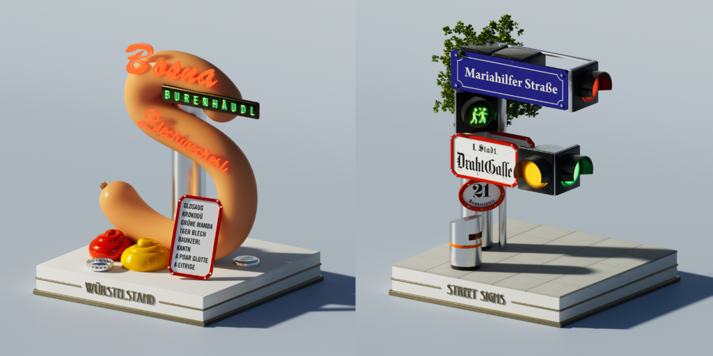
I lived in Vienna for half a year because I did an internship there during my studies. I chose many places that felt very important to me years ago or that made a unique impression on me. The typeface includes the most important and famous sights, but also some secret places I discovered on my own. Some letters aren’t simply portraying architecture. For example, the letter S portrays a certain aspect of Viennese culture.
Your approach seems to be more about your own feelings and the places you have already visited. It’s very interesting when people use a subjective approach to their projects. How would you describe your portrayal of the city?
I was asking myself, “How can I portray a city? How do I perceive the city and its unique style, and what makes the city the city I know?” I thought, “Okay, architecture is one of the things that distinguishes every city from another. If you are in Paris, the houses and everything look different from Vienna or New York, for example.” People and culture are also significant. I always have a preference for very detailed things because I think you can get a lot of inspiration from the small things you don’t notice at first; you have to look a little bit closer. For example, I did this for the Vienna typeface. What I think defines the style of a city, especially European cities, is the typography of the classic street signs. The old street signs in Vienna have a certain style, which I implemented in the letter F, trying to capture the look of the streets, the houses, and the city in the letters.
Could you describe your design process? Were you focusing more on reducing elements, adding new ones, or on a mix of both?
I would say it’s more of a mix of both. I see the design process as more of a circular process. Whether I’m doing editorial design, typography, or even designing a logo, I always find myself struggling between adding details to the design and then reducing and removing them again. I guess this is my process or approach to design. If it’s too busy or has too much detail, I move to the reduction process; it’s always a cycle of details, reduction, details, reduction. I had to set up a basic configuration in the 3D software to focus on this circular design process. You’ve seen every letter stand on this podium. I had to build that so I had a setup where I could create letters, work on their shapes, and apply textures. This basic setup allowed me to get creative within a framework of restrictions. Once I had set up the 3D scene, I no longer needed to adjust basic settings like light and shadow when starting a new letter. This way, I could concentrate mainly on the shape of the letter and the textures to make it lively.
You’ve already told us a lot about the process, but the big question is: What came first? Did the entire project come to your mind all at once, or was it more of a project where you had an initial idea and then built everything up from there?
I would describe it mainly as the “chicken and egg” problem. I’m not very sure if there was a big idea first to make this big alphabet of Vienna or just a single letter inspired by architecture. I guess it was more like I wanted to do the letter A because I love the letter A; it has such a great shape. I felt that you could translate the shape of A very well into a 3D perspective. The letter A was the first thing, and then came the idea, “Yeah, let’s do the whole alphabet this way.” To better illustrate the process of building each character, I can show you a few screenshots.
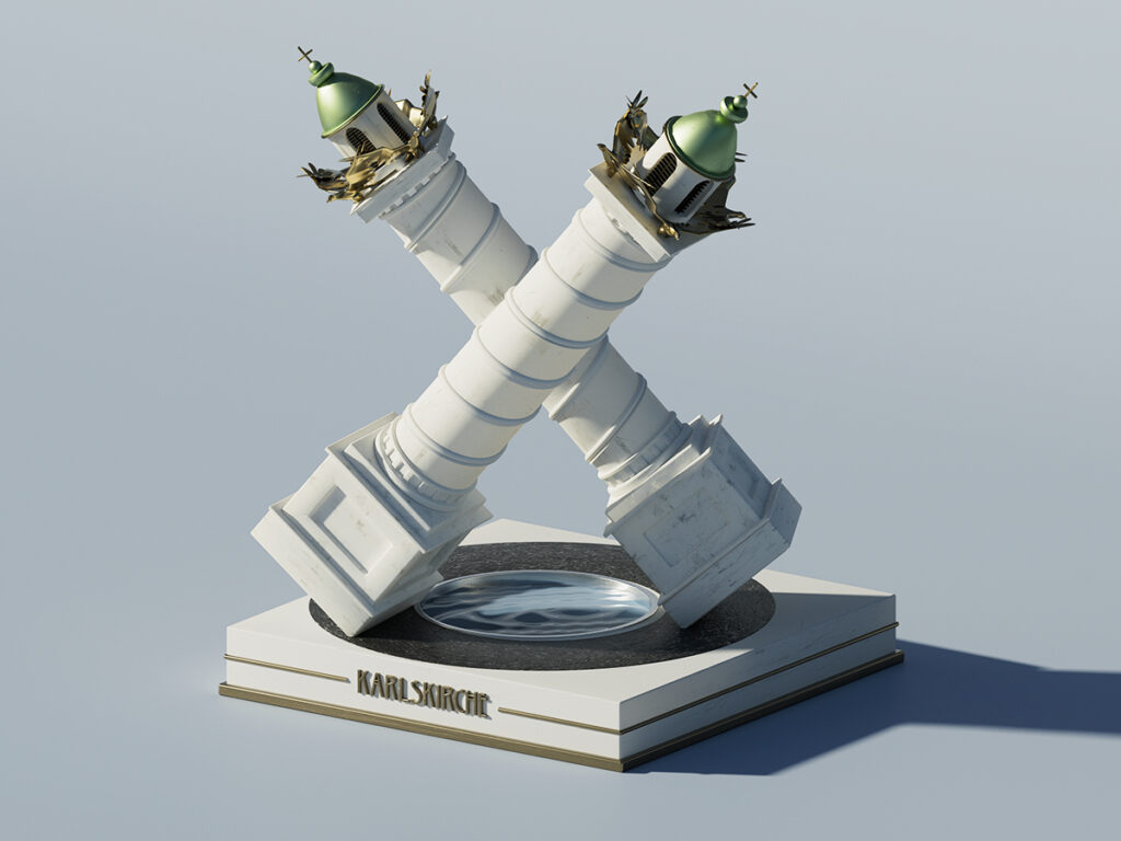
I guess the best way to describe it is with the letter X. The first step was having an idea of what I wanted to portray, for example, the Karlskirche, a very famous church in Vienna, and deciding which letter could fit the church. If you look at the Karlskirche, there are two towers that are very predominant in the architecture. So my idea was to translate this into a letter, and the letter X was the best way to do that. By crossing the two towers, you can build the letter X.
In the first step, I always worked with very basic shapes (cylinders, circles, spheres, quads, and cubes) to find the predominant form of the letter. Then, I added more details and visual elements to that basic shape until I was happy with the overall design. During the process, I constantly refined the shape of the letter to ensure it wasn’t lost through the added details. I aimed for a very clear shape so that you could recognize the letter even if you weren’t familiar with the project or its concept.
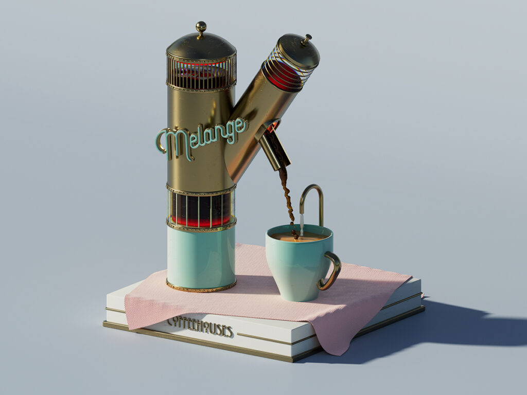
Once I was happy with the basic shape or the modeling, I began adding textures. In 3D space, this means defining elements like color, light reflection, and surface quality. For example, if the hawk is golden, I would adjust the color, its light reflection, and whether it has a glossy or rough surface. The letter was then created step by step through this process. I can show you another example, which has a more complex form. This is the letter K, where I portrayed Viennese coffee culture. Coffee culture is very famous and has been important in Austrian history, with a tradition of drinking coffee in cafes.
For the letter K, I was inspired more by a cultural phenomenon. Coffee house culture has always played an important role in Vienna. Sigmund Freud and other famous artists and scientists met in Viennese coffee houses for cultural and artistic exchange. The first step was to create a basic shape, trying to transform the idea of coffee flowing into a coffee cup into the shape of the letter K. I started with this basic shape, then refined everything step by step.
There as well – you can see clearly how everything started. These are just basic shapes, such as long cylinders and quads, which are arranged to build up the final shape. These basic shapes were then refined into the final form and rendered or textured to look like something real, for example.
How did you get into spatial 3D typography? Do you think it’s prioritizing legibility, or is it more about being an art piece?
As a typography lover, readability is always the main goal. If a typeface is not readable, it’s basically useless. However, with this project, I can see another perspective as well. By creating complex letters that are not readable as normal typefaces, you can offer new potential and surprise, as well as capture the attention of the viewer. I also received feedback from many people that the letters caught their attention very well because they are so complex – they present tourist attractions in a different way, for example. In this case, typography serves mainly as a medium and form that doesn’t have to be readable, since you’re not writing words. It’s more of a playful approach to the typeface, I would say.
Usually, when people create typography based on an object, the first letter is often made from that assigned object – for example, an apricot for the letter A. But your letters do not directly correspond to the destinations they represent. Was this intentional because you felt it was too cliché, or was it not part of your original idea? How did you approach this?
I really had the privilege that it was an art project, so I didn’t have a client saying, “Uh, you have to use S for Stephansdom (St. Stephen’s Cathedra – ed.), for example,” which would be the S equivalent. When I started building those letters, I quickly realized that if I restricted myself with the letters, the creative flow wasn’t as good. I didn’t want to limit my ideas just to the letters, as it was an art project, so I gave myself the freedom to explore. If you were working for a client, that wouldn’t happen, but in this case, I found it very interesting to see the result of this open-minded approach. This open-mindedness also gave me new ideas for the letters because often it went like this: I was working on a specific site for the letter O, then I tried something different, looked for the right shape, and realized, “Ah, okay, but this would be a better R,” for example, and then I switched over. It was a continuous process that provided a lot of inspiration, and I ended up skipping the idea of connecting the naming of the site or the thing I portrayed to the letter.
Thank you. I would say that it’s very good advice – not to restrict yourself with those boundaries. It’s almost a tradition, but it can be very restrictive. It’s like, “Oh no, I need to assign an object to the letter O! I can’t find an object that fits the letter O, and it doesn’t match, but I have to force it in!”
That was also a learning experience for me. When you start doing freelance graphic design after your studies, and you haven’t done much client work, for example, I think this is the hardest part – working within that framework. You learn quickly in a few months, but I saw again that if you work on your own project and give yourself the freedom you might have in student projects, where there is no client telling you, “You should restrict yourself to that rule,” a non-restrictive approach can lead to a lot of creativity. That’s what this project should be for me – it should be fun so that I have the power and creativity to experiment and improve my 3D skills, as I primarily undertook it to enhance my 3D capabilities.
Why did you choose Willow Font for the project? Was it a simple design choice, or was there a specific reason behind it?
For Vienna, the Art Nouveau period was very important. If you go to Vienna, the architecture throughout the city portrays this specific era – which is called “Jugendstil” in German — and this is one of the distinctive styles I see when I look at the city as a whole. The Willow Font has a classic character, with its high x-height, and features special and playful glyphs, such as for the letter O. It resembles a font that Alphonse Mucha might have used, which was essentially the reason behind choosing it. I have to say that in no other project would I have chosen the Willow Font because it’s not a professional typeface as we are used to working with. However, I was really looking for a typeface with that specific character and couldn’t find one. So it was the best solution. When I brought the Willow Font into Cinema 4D and extruded the letters into three-dimensional space, I discovered that the letters looked good once they were extruded. That was the choice I had to make – to not use a “professional” font but to enhance the overall impression of this humanist style.
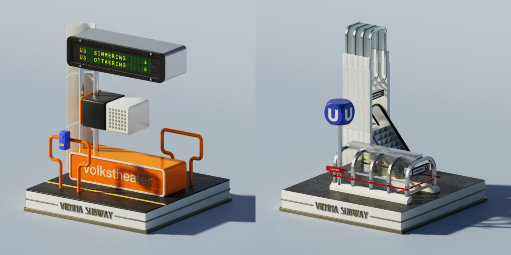
The letters L and E are based on the subway. Is the subway a prominent part of the Vienna cityscape?
I wouldn’t say that it is, especially for Vienna. When I looked at what is typical for a city or what defines its vibe and style, I discovered that public transport is always very important. As a graphic designer, I see how the typography on public transport signs plays a significant role in giving the city its unique style. These signs are everywhere—on buses, trams, and in stations—and their distinctive typography really helps to shape a city’s visual identity. I think this is particularly true in Europe. In America, the signs are more generic. But if you travel to Paris, for example, you’ll find old, very artistic metro signs there. That was an additional reason to include public transport and the subway, as well as their colors and lines, because I think it’s a really important aspect of life in any city.
Are you planning to expand the Vienna Typeface to include numbers or punctuation?
I was thinking about it, but at the moment, the project feels complete to me. I would rather work on a new city and create a new alphabet there, because that would be more fun than working on the old project.
If you had the chance to go back in time and make a major change that would alter the entire trajectory of the project, what would you change?
If it’s a bigger change, I would say I wouldn’t concentrate on architecture. I would, more or less, focus on aspects of life or cultural elements and try to incorporate those into the letters in a way that doesn’t immediately scream “This is Vienna because of architecture.” I believe this approach could allow for more storytelling. People would need to ask, “Okay, what is behind that letter?” so they don’t see it immediately. This might inspire them a bit more, I think.
Do you have any final thoughts or words of wisdom for design students or other designers?
What I’ve learned in the last few years is to stay curious and always act on an idea as soon as you have it, rather than overthinking it. To put it simply – if you have an idea, just start doing it! Take the time and just do it because that typeface is a perfect example. I had the idea, and a few years ago, I wouldn’t have completed it or even started it because I might have said, “Oh, there’s client work” or “I want to do sports” or something like that. But this time, I had the idea, sat down, tried it, and then the project started to grow. I never imagined it would become an award-winning project. Initially, the project was just for learning 3D. Then a friend of mine suggested, “You should apply for graphic design awards,” and I ended up receiving five awards for it. What started as a passion project led to other client opportunities. So, stay curious and do what you love, and the client work will also come and offer you opportunities.
The material has been created as part of the Spring 2024 Semester assignment for the Elements of Visual Communication Theory (EVCT) course, conducted by Dr. Monika Marek-Łucka at the Polish-Japanese Academy of IT in Warsaw.
Illustrations source: https://www.oneclub.org/awards/tdcawards/-award/46181/vienna-typeface
More about the Vienna Typeface: https://www.ricardodesign.at/project/vienna-typeface