„As designers, we always enjoy seeing
what we’ve created out in the world.”
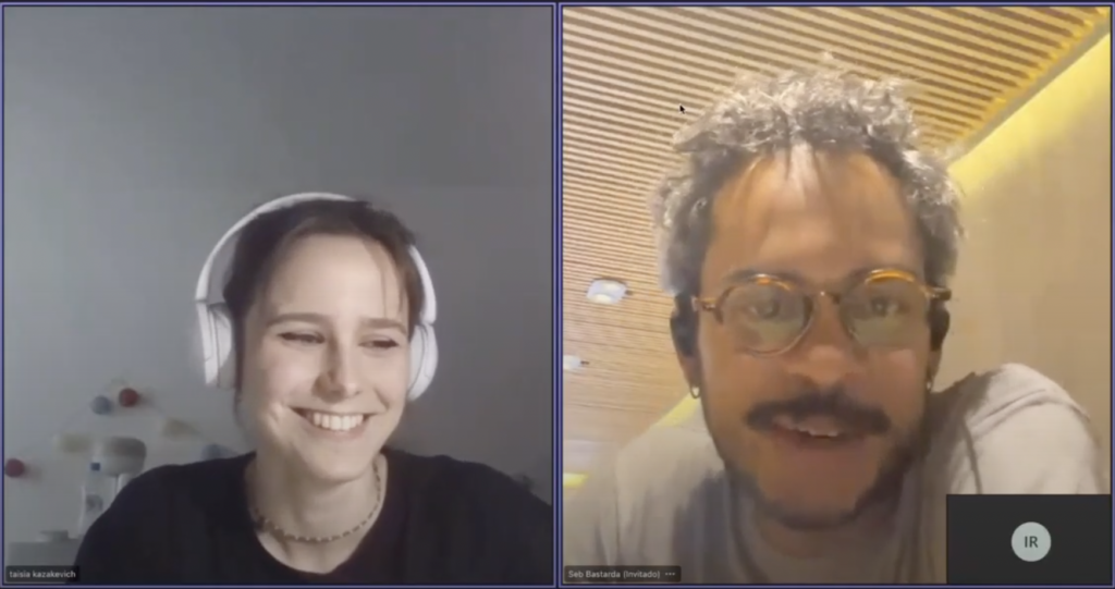
Interview with Seb Castellanos de la Hoz,
Co-founder & Type Designer at Bastarda Type Studio
by Ella Kowal, Taisa Kazakevich, Uliana Lysenko, Valeriia Bieliakova, Anastasiia Latysheva
(May 2024)
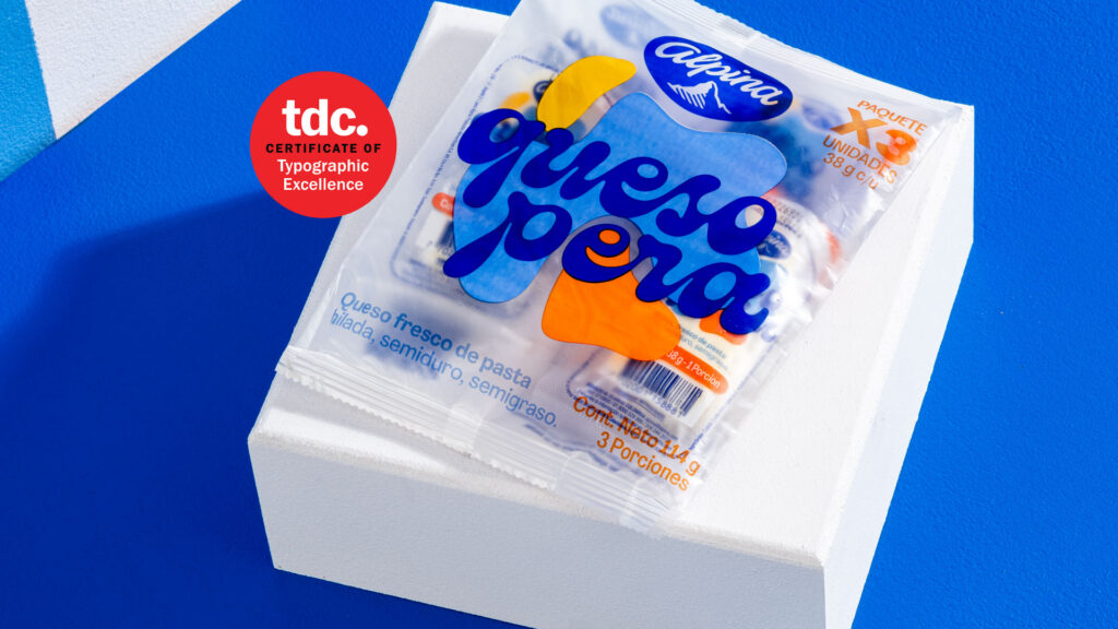
Today’s interview is all about your incredible project, Queso Pera, which has been honored with the TDC award. To start, we’d love to talk about something fun—cheese! I’ve actually read a bit about it, and it got me curious…
Cheese?
Queso Pera cheese is quite popular in Colombia, right? My question is, were you familiar with its production before starting the project? And do you know how this cheese is made?
Well, yes, we knew the brand behind it. So when the project arrived at the studio, we knew it was going to be for a big brand. That’s why we wanted to put a lot of effort into the design because the brand is quite big here in Colombia, and that kind of cheese is quite popular, let’s say, in kids’ lunches, like for schools and for people who are working all day. So people try to have one of those cheeses in their pack. It’s very popular because it’s small. From the beginning, we knew that because of the type of cheese and the brand behind it, it was going to be a major project in the studio.
Oh, that’s great. So, since it was such a big project, did you have a lot of requirements, or were you given more creative freedom?
We did three tests at the beginning with the agency I mentioned before on Instagram. We normally work with this agency here in Bogotá. They’re called Siegenthaler, a Swiss-Colombian designer. During the process, we went through different stages of letter deformation. It took quite a while—around 20 days, or almost a month—to finalize the logic behind how we wanted to deform the letterforms.
The Queso Pera logotype is variable. Was that your idea, or did the client specifically request it?
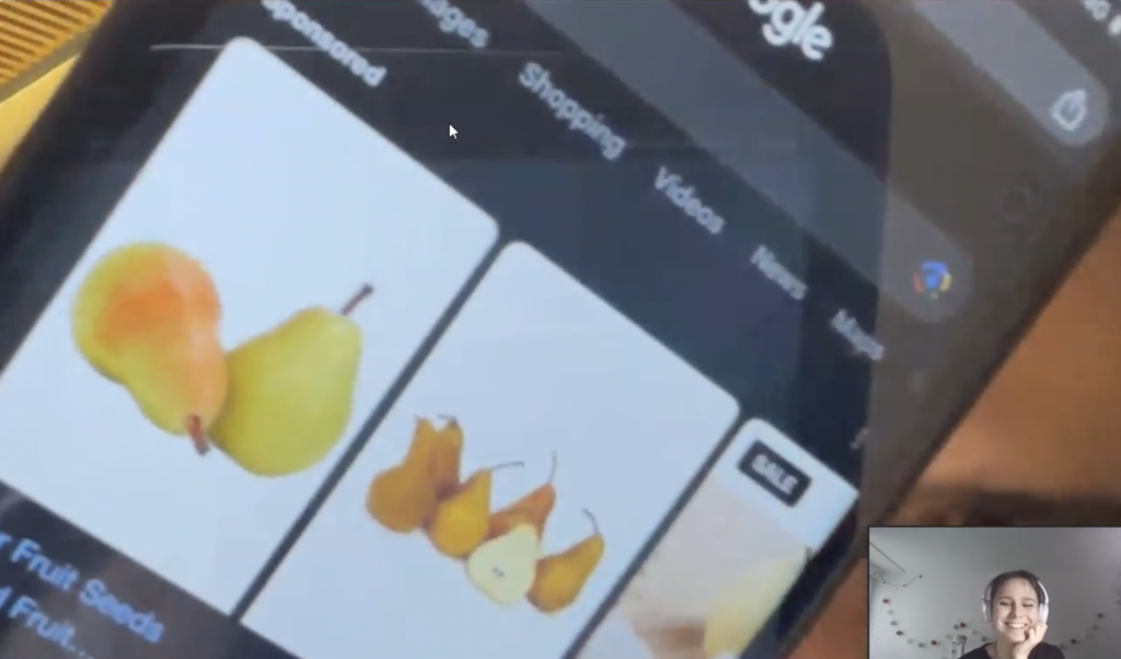
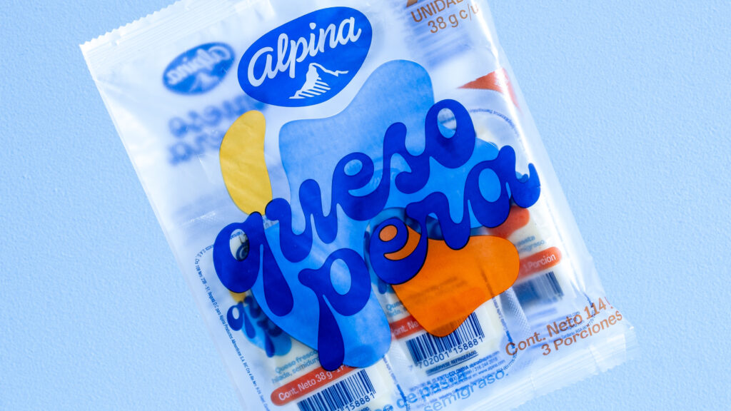
Yeah, we were thinking about making this logotype variable. So in the process of deformation, when we talked with Siegenthaler, they didn’t want to go with that idea to the client because it is a big brand. Normally, those brands don’t like to invest in these kinds of experiments or anything like that. In the end, our direct boss on the project was Siegenthaler, but we managed to talk with him and say it was worth making it variable because of the shapes. In the end, he said, “Okay, let’s try to test two letters,” just two letters, and he liked the idea. So he said, “Okay, let’s develop it for the big old brand.” The problem was that the brand changed the name about four times during the process. Everything was happening at the same time: the agency, the final brand, and us—we were working together and trying out different names. At the beginning, we tried the deformation, and after we had that clear, we started testing the names they already had—like four names—and we were jumping between those names to figure out which was best for the brand. In the end, the name, „Queso Pera,” in Spanish is a descriptor. It’s not a brand name, but it means cheese like pear. So, because the cheese has the same shape, we call it that way here in Columbia. [Seb shows an image o his iPhone]. And the cheese also has these shapes, but it doesn’t have anything to do with the flavor of the cheese, of course. So that was kind of the story of why we asked it to make it variable, because of the interesting shapes that we were developing with the studio.
As you mentioned, you started with two letters—could you share which ones they were and why you chose them? Were they handwritten to begin with, or how did the creative process unfold from there?
They were actually vectorized at the beginning. We tried the text ILLI, with an I, double L and I again. So if we develop only those two letters, we construct a logo of four letters. So the first name was ILLI, that was a brand name. And then they changed a lot of various names at the end. And yeah, what I was telling you, the Queso Pera was the description name that they would choose.
Okay. And what tools and media did you use to develop such strokes and variable shapes?
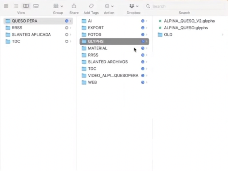
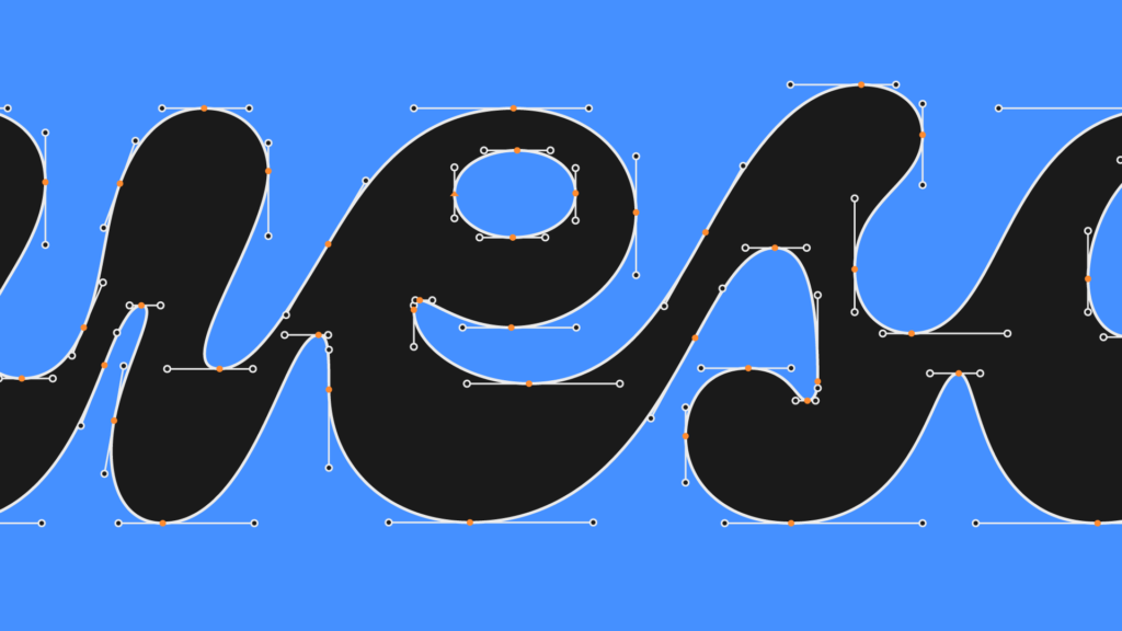
We work with GlyphsApp. It is specialized for type design, but we normally use it also for logos, because the basic curving tools and the handles work very well in Glyphs. So we were using Glyphs and also we have a variable testing inside Glyphs so we can see how the viability is working in the program. But its an extra plugin that we installed in Glyphs app. And yeah, we were working in that program.
Did you use any Adobe program, like Illustrator or something else for vector?
No, we don’t. We normally send the files to our clients in PDF or in Illustrator to check, but we don’t use it in the design process. Just to show the outcome in the final.
I came across your interview with Design Kits from 2018, where you mentioned that you enjoy listening to music and drinking coffee while working. I’m curious, what kind of music did you listen to while creating the Queso Pera logo?
Well, we love to listen to rap and hip hop. My friend here, Yei, is an avid collector and has a lot of knowledge in that genre. So, yeah, we were mainly listening to hip hop. And we have some tropical music in the studio as well. Salsa, I don’t know if you know Salsa, you know what is it?
Yes.
Oh, you know. So we were listening to Salsa most of the time as well. You can see here, we normally organize our files this way [shows a screen]. We also like to do some animations of the projects that we developed. So the idea was also to include that in this project, to animate it a little bit more.
Also, about the music—does listening to it help you work faster? How did you come up with the idea? Was it just a spontaneous decision to play music without headphones?
I don’t think it’s that kind of thing. I mean, I can’t work in silence; music is a part of what I need. However, I don’t think the type of music necessarily gives you better ideas. But we definitely need to listen to music while working.
Yeah, I get that. We also have a lot of homework at our university, and music really helps. So, about the project—how much communication did you have with your client? Was it a lot of back-and-forth or just a few messages?
We normally try not to use WhatsApp. However, because this client is very important, we kept the conversation open all the time via WhatsApp. Now we are working on Slack, so we are trying to avoid WhatsApp for work. But yes, there were many names, chats, and calls with the client. We don’t work directly with the final client, the big cheese brand, but with the agency. So, our closest relationship is with the agency.
When did you realize that this was the final and best version of your logo?
Well, I think there’s always room for improvement (that’s my belief) in any project. But of course, in this case, I would say that probably… The agency had to develop all the other brand assets, like the packaging, the colors, and the animations for social media. So there was a point in the project where we needed to send the final file because they had to work with it for the next part of the project. So, I would say there is always room for improvement, but for us, with the deadline being about a month before their presentation, that was the last moment. And we always said, „Okay, if you see anything extra, just let us know. We can improve any curvature or anything.” But in these brands that are too fast-paced, or not too fast but too corporate, you need to make a decision and say, „Okay, this is the end. We need to send the file because they are asking for it every day.” So yeah, it’s more about meeting the brief and then sharing the outcome of the project.
Okay. During your communication with the client, did you receive any negative feedback? How did you handle it, especially with the pressure of the deadline and everything else?
Well, we really love what we are doing here in our studio, and we are very close, almost like friends, with our client, the agency. So, the conversation at the end isn’t about liking or disliking something but rather about “I think we need to improve this” or “I think we need to pay attention to these details.” It’s more of a constructive dialogue between us and the agency. There has never been any negative feedback. Of course, in some cases, we’ve said, “It was better before.” For example, I liked the previous name, Illi, a little bit more than Queso Pera because, in Spanish, Queso Pera is too descriptive and obvious. But it’s good for us as well. We try not to argue too much with the agency. We follow the brief and maintain direct communication, and that’s it with them.
And one last question: What was your favorite part of designing this logo?
Oh well, the variation. That was the thing I wanted to show you because when we started designing the variation, we saw the potential and the beauty behind it. So I believe the best part was testing the variability.
If you had the chance to revisit this project, is there anything you’d change, or would you keep everything as it is?
Um, I don’t know. That’s a good point. For sure, maybe some details in certain shapes. Controlling the shapes in the variability is quite complicated because they tend to shift a bit during deformation. So, maybe that would be part of the improvements. But overall, I wouldn’t change anything about the process. It was a really nice project and enjoyable to work on. I really like seeing it in the supermarket and in ads on the streets. It’s great to see the project’s outcome. As designers, we always enjoy seeing what we’ve created out in the world, and this project is particularly special for our studio. We’re focusing more on logotypes rather than developing the entire brand, communication, packaging, and so on. This was a significant project for us to showcase our specialization in logotypes. Since then, we’ve worked on many projects focusing on the finer details of logotypes. But yes, seeing it on the streets looks very nice.
The material has been created as part of the Spring 2024 Semester assignment for the Elements of Visual Communication Theory (EVCT) course, conducted by Dr. Monika Marek-Łucka at the Polish-Japanese Academy of IT in Warsaw.
Illustrations source: https://www.oneclub.org/awards/tdcawards/-award/46184/queso-pera and private documentation.
More about Queso Pera project: https://bastardatype.com/brands/queso-pera/

