69th TDC Annual Competition Winner
„People like puzzles;
humans like to figure things out.”
Interview with Judith Mayer.
by Sofiia Tantsiura, Yelyzaveta Fedorenko, Elizaveta Romelashvili & Heorhii Pavlov
I have to say, your project really inspired us. Your experimentation with letters and the ability to present them as abstract forms is truly impressive.
I think it started back in school when I went to Ball State in Indiana, which is one state over from where I am now, in Chicago. The first project I ever had in my graphic design curriculum involved abstracting type. We had to draw letters with Rapidograph pens and take a word, drawing it in a way that reflected the word’s meaning. We had to break out of the type form and exaggerate the letters to conceptually show what the word meant. It was about thinking beyond text blocks and headlines, focusing more on the beauty of letterforms. So yeah, I’ve always been interested in the finer aspects of typography. There’s always that idea in graphic design as well. Being a logo designer, one thing they teach you in the beginning is that people like puzzles; humans like to figure things out. And having logos be intriguing enough that make you stop for a moment, but then easy enough to figure out in a moment, that’s the kind of balance you need to make an interesting logo. It’s not just like, “oh, I can tell what typeface is,” I’m completely ignoring it. It’s just sort of the backdrop. But there’s something about it that you’re like, “hey, wait,” but then it’s not completely illegible. Logo design sort of taught me how to walk that line. But I always like not doing the same thing that’s come before for logos. But trying to make something new, a form that’s new, but still completely readable.
It took a bit of time to understand what each painting was saying, but that just made it even more captivating. Every phrase felt more meaningful because of it. Actually, I wanted to ask—do you have a specific creative process you follow? Maybe you have a go-to formula for creating your art, or is it always more unpredictable?
I don’t often have a preconceived idea of what the word is going to look like. But sometimes I take inspiration that leads me in a certain direction, like looking at historical forms. I don’t know if you’ve noticed, but I have an affinity for reverse contrast letterpress, like wood letters, with that sort of circusy vibe you get because many circus posters were printed with heavy stress on the top and bottom, but not in the middle. Back then, certain typefaces were called hideous and all that. Those are the ones I love the most because your eye isn’t used to seeing reverse contrast. It stops you—and makes you appreciate the form.
So sometimes I’ll start with that kind of idea, but then I don’t know where I’m going until I do. I guess I would describe my process as what I learned in school, which is to iterate, like drawing. I don’t know if you’ve ever had a project where they ask you to draw 100 thumbnails. Do you guys do thumbnails? They’re like little one-by-one or two-by-two squares of ideas, so you’re not stuck in the details. But you’re sort of working out ideas. It’s almost like visual note-taking, asking, 'What if I change the shape or the scale of the letters?’ Or 'What if I made them into a perspective drawing?’ So you’re really just note-taking all these different ideas in your head. But it forces you to come up with things, pushing yourself outside of where your first solutions are. And when you do lots and lots of those, they’re called thumbnails just because of their size—they’re not bigger than a thumbnail. That’s why they call them that.
And I think that’s missing in a lot of courses in the US right now. They’re getting back to it, and they’re starting to talk about design thinking as a course to teach you what we were taught, which was integrated when I went to school. You’ve got to really sketch a lot, get past your first easy solutions, and dive into something new and different, where you’re not sure where you’re going or you feel uncomfortable. Those are the ideas that push your style and help you figure out what you like and what you do because you’re thinking more, not just saying, 'Oh, I know what that should be,’ and you’re done. When you work with clients, sometimes they’re like, 'I don’t want that,’ and you’re like, 'Oh, I have to come up with another solution.’ You thought you already solved it, but no—you solve it again, and again, and again. From there, you can pick an interesting idea.
So yeah, my sketchbooks are really hideous. They’re not beautiful, like Instagram sketchbooks. They’re just notes, lots of words, and really rough concepts that I can get out of my head to get on to the next one.
So you never really know what the final result will look like. It’s interesting. When you mentioned thumbnail sketches, I guess what we do is more like collecting ideas or mind mapping. But we always keep those ideas in the back of our minds.
Just even put it on paper and get it out of your head. So mind mapping is how you’re used to doing that, and that’s great. Because some people just go right to the computer and make a thing, and then they’re done. And they miss the whole part of design, which is sort of the exploration and problem-solving and coming up with multiple solutions and finding out which one is the best.
In 2022, you were commissioned to create artwork for the Carlton Terrace Apartments in Chicago, covering four floors of the newly renovated building. You ended up creating eight typography paintings with specific phrases. Did the residents find these works to be a good idea? Were they satisfied with the results?
Well, you can’t please everyone, but overall, I received great feedback from that project. It was more aligned with my fine art, sort of a crossover into public art. Typically, in projects like this, it’s a public art call. They put out a request for qualifications, and then they call you back to do sketches for a smaller fee. The person who wins the commission gets a larger fee to complete the final work. That’s pretty standard for public art projects. Since these calls are open to anyone, I don’t usually work directly with individuals. Instead, I collaborate with entities, in this case, a hospital that was rehabbing apartments for underserved communities.
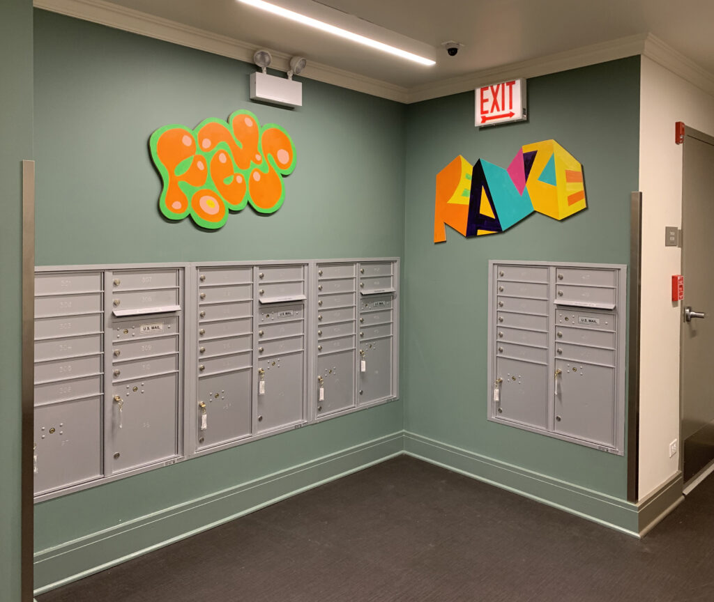
The building housed people in need of social and financial services. The first floor had support staff, while the residents lived in small, efficient units on the floors above. I worked with both the staff—nursing and social services—and the residents. When I did workshops, I walked the residents through my thought process, which involved thinking about words and how they sound. We discussed the 'mouthfeel’ of each word and touched on things like onomatopoeia, where a word sounds like what it is, such as 'bang’ or 'pop.’ Most of the residents weren’t familiar with these concepts since they weren’t designers or college students. They were more focused on survival skills, training for jobs, and things like that. This workshop was more of a creative outlet for them. We explored the sounds of words, the shapes of letters, and the meanings behind them, showing how letters could be manipulated in different ways. Then I had them work with words they liked—either for their sound or meaning—and draw how those words felt to them. For a couple of them, I offered to digitize their work and create a small print they could keep in their homes. It became a very personal interaction. I think they appreciated the workshop because it was something they wouldn’t normally choose, but it ended up being fun and creative. It’s hard to find time for art and creativity when you’re focused on building practical skills for a job. So it was interesting interacting with a population I usually don’t work with. I’m used to working with business people, but this group had different challenges and seemed to enjoy the creative freedom they don’t often experience. When I was installing the art, many residents had already moved in, and some commented that the work reminded them of graffiti, which resonated with them. That was the goal—to create something that felt aligned with their lives, something they could connect with. I avoided anything too corporate in favor of something more relatable.
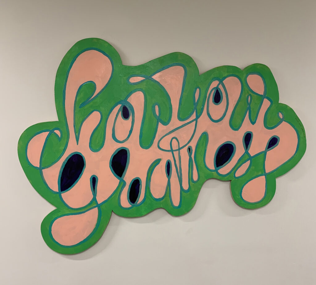
I created pieces inspired by graffiti styles, as that’s what surrounds them in their daily urban environment, similar to where I live. But the work was a bit different—it was more polished graffiti, drawing inspiration from historical forms. It wasn’t just a copy of the most popular graffiti letters, but you could see the influence. They liked how graffiti letters are often puzzling, requiring you to take time to figure out what they say. That interaction was part of the appeal. While installing the artwork with the team, the residents enjoyed figuring out the phrases with us. It became a conversation, and I appreciated the direct engagement with the people. I think that’s a key component of many public art projects in the U.S.—there’s usually an interactive element with the community, rather than just delivering something you want as an outsider. In this case, I asked them what phrases they wanted, which was interesting. Normally in my fine art, I use cryptic, personal phrases with double meanings. But the residents were more focused on straightforward, action-oriented words—something tangible and relevant to their lives. They wanted words that were inspiring and empowering but clear, without confusion. This shift, inspired by their preferences, led me to adjust my process in an interesting way.
Did you choose the phrases and words together with them?
Based on my discussions with them, I gave them lists and lists of some of my ideas, and asked for theirs as well. The staff picked a few from my selections, but the residents really pushed me to rethink them, making the phrases more simple and straightforward. Their input definitely shaped the final choices. So yes, they were definitely driven by their ideas and their way of thinking and speaking.
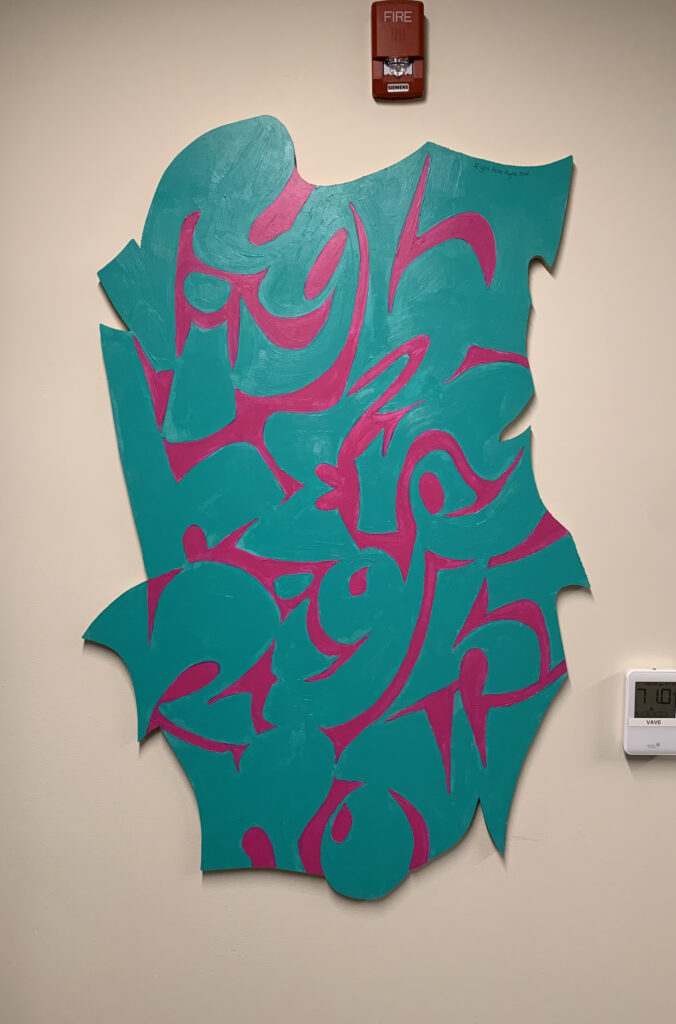
I spoke with so many different people, trying to get a sense of the overall vibe and where their interests lay. What really stood out was their focus on action—words that had a sense of immediacy, about the present, and striving to be your best. These words felt almost sporty or athletic to them. They resonated with something like Nike’s „Just Do It.” I showed them a bunch of advertising slogans, and they all agreed that was the perfect slogan—speaking to them directly. One of the phrases I used, „Right here, right now,” felt more straightforward to them. For me, it’s a simpler thought, maybe not as cryptic or layered as I usually go for, but they wanted something they could connect with immediately. So I leaned into that simplicity for them.
Their lives are centered around motivation because they’re focused on gaining skills and positioning themselves for more success. Their present mindset is, “I’m doing this, I can,” “If I put effort in, it’ll pay off,” and “I need skills.” There’s a positivity in their striving, and that resonated with them through athletic language—because you can achieve if you really put in the work. That’s why they connected with action words. I think they were also drawn to it because of its positivity, and the words would live in their space. A lot of people love motivational things because they serve as a reminder to have gratitude and focus on their role in life or their purpose. It goes deeper than just, „Well, maybe they’ve never tried outside of their box.” No, this is where they live, and it’s very important to them to be their best. That’s what I gathered from my conversations with them. Language became that connection. We talked about how I use language and how they use language, since we come from different bubbles. I had to adapt to their way of speaking and thinking.
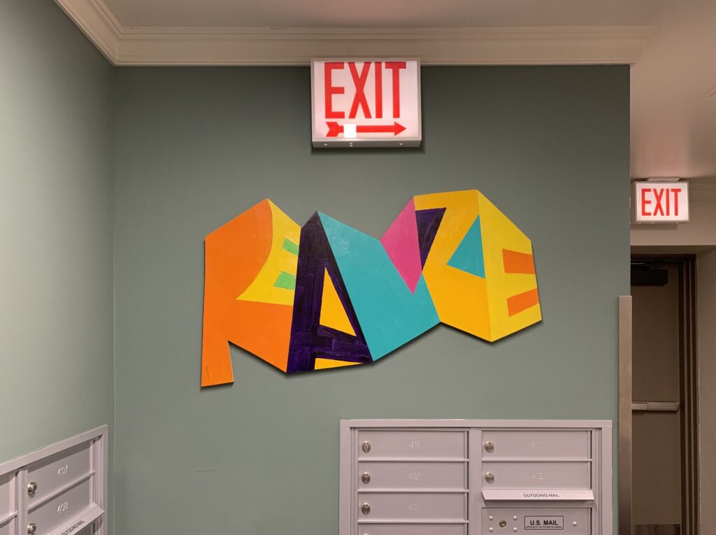
Yeah, I think the word „realize” has the most impact for me. I really love how this piece turned out. And knowing the backstory behind it makes it even more powerful than something like a „just do it” quote.
The words were chosen based on the process, the interviews, and similar considerations. It was like what I do with clients, because they essentially are my clients—they will live with these words in their common spaces. I definitely felt it was important to have a real discussion with all of them. Instead of just creating decorative pieces or things that look cool, I wanted the meanings to add another level. There’s the visual aspect, and then there’s the language. It’s not just abstract paintings; they can be appreciated on an abstract level, but the content and meaning inside them deepen the significance. To me, they’re more important because they are words.
Have you visited the building since then?
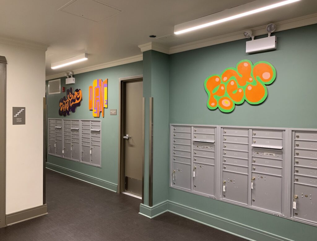
Yes, there were lovely to see. They did like a ribbon cutting because there were two artists, me and another gentleman, an artist who did a collaborative project more about them painting. He created an abstract background, and during the workshop, everyone got to pick up a brush and add to the painting. So, that piece was something they had a hand in creating, in a different way from how they contributed to my work. His art was displayed in the front room and entryway, while mine was in the computer room, the main hallway, and the mailroom, where I had a series over the mailboxes. All the communal spaces featured artwork that was custom-made for them. It looked great in the building, and the staff was pleased with the results. They appreciated that the work was different from their usual institutional style. That’s why they chose both artists because they wanted stuff that had more of a connection with people in the space and wasn’t just prettiness on the walls that didn’t do anything, just filled up the wall.
Earlier, we talked about your interactions with the residents. Is there one particular moment or interaction that stands out as especially memorable or interesting to you?
The highlight, and the weirdest thing, was that there’s always one person in every class or workshop I conduct who just doesn’t want to follow any of my plans. They pick up all the materials and say, „I’m just going to draw and do my own thing.” So, they sort of took ownership of the workshop in their own way. They were like, „I’m here, I’m doing what I want, and then I’m leaving.” I wasn’t able to guide them because they were fine without me. However, the more interesting interactions were during the installation of the actual pieces. People were excited to see the ideas I had presented come to life. Hanging them in their space, the pieces had a significant impact compared to the small digital previews. Everyone passing by in their communal space saw the installation process, which took a long time because each piece had to be anchored at multiple points to prevent them from being easily removed. That’s why I had a professional installer provided by them, which was great. I was basically his assistant, helping to hang all the pieces. The largest ones were about four feet by four feet—quite big, but necessary for the space, which otherwise felt empty. The conversations with the residents, hearing how happy they were to see the art and their excitement about having custom artwork made for them, was like receiving a gift they hadn’t expected when moving into the space.
I guess these huge artworks really transformed the whole space. The walls, which were previously empty, became canvases for new art, creating a unique, in-situ experience.
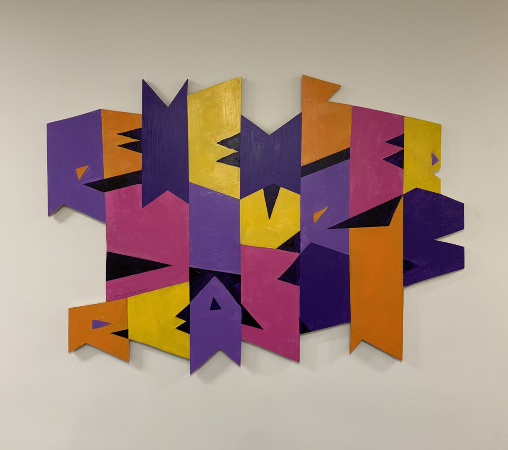
Yes, especially in the mailroom, it was done as a series that went all the way around. As you walk through the space, the series reads like a sentence, presenting a continuous thought about the process of expression and focus. The words combine in a story with a certain order: „Just be who you are,” „Right here right now,” „Remember your reasons,” „Show your greatness,” „Define,” „Explore,” „Focus,” and at the end, „Realize.”
There are different ways to think about an idea, and then the end result is realized. The idea is realized at the end, so the words flow through the process of how they thought, step by step, getting to where they want to be. This was spelled out in a linear viewing because they always come from the same angle when they enter the room. We started with a left-to-right reading direction.
I always think about things like in-situ—how is it going to work in the space? How big does it need to be? Where is it going to be hung? Where can you view it from? So we went and pre-visited the space before I built anything. This way, I could take pictures and see where the best vantage point would be to place it and how big it needed to be on the wall. Just like with a client project, I want to know how it’s going to be used. If it’s a logo, I want to know what its primary use will be. Will it mostly be in color? Will it be mostly digital? Do you need it in just one color because it will be used for etching or silkscreen? How is it going to be used, and what are the other uses it needs to accommodate? How large or small does it need to be? Does it need motion? How is it going to be used, and what is it supposed to communicate? It’s like starting with the kernel of an idea, experimenting with different expressions, and then narrowing it down to the idea you want. After defining that idea, you realize it. These kinds of words follow the thought process of creating something.
What is your definition of being creative?
First, I’d have to say that when creating something, you need to first envision it in your head and then make it happen. To me, design is fundamentally problem-solving: you have a problem or a goal, and design is how you address it. It involves thought, experimentation, refinement, and focus, as well as the actual construction or technique and the concept—essentially, all the components that come together. Even though it’s a complex process with many tasks from start to finish, it starts with a problem or an idea that needs to be solved or developed. The challenge is figuring out how to get from where you are to where you want to be, even if you’re not entirely sure where that destination is yet. You need to have a reason for creating something and think about how to adjust your approach along the way.
For me, creativity is… I see a lot of chefs as artists because they consider taste, combinations, aesthetics, plating, and all the elements that influence the dining experience. These are the same factors a designer must think about, such as how people interact with their work. In branding, it’s not just about the logo; it’s also about the voice, the room’s temperature, the carpet underfoot, the receptionist’s interaction, their choice of words, their personality, the overhead music, and even whether the lights flicker. All these elements shape the company’s brand. It’s not just about what we are but who we are and why we are.
I always ask brand designers, „Why?” That question highlights the problem they are solving. „Why?” is a big question in my work. When working with companies, I look for their philosophy. Why do they do what they do? They could choose other ways to make money, but there’s a reason they picked this particular path. That philosophy, that „why,” creates a stronger visual identity. It allows you to highlight what is truly important to the company and its users, making them more attracted to the brand. Instead of being interchangeable and selling any widget, it becomes clear that there’s a specific reason behind what they do. If you tell me “why,” I can visually describe those things to your potential customers, and they can connect with you. The „why” behind problem-solving and creation is, to me, the essence of creativity in what I do.
The final question I have for you is: If you had to describe this project in just one word, what would it be?
Language. It’s so important. From the beginning, whether you believe in cave people or whatever your beliefs are, language is how we communicate. From hieroglyphics and cave paintings to modern text, it’s fundamental. The form of language is what I love about using words. Even just type characters—like the letter “a”—can take many forms. Some look more like an “a” than others, but each “a” communicates something. In every language, a glyph functions differently, even as a letter. It’s the basis for communication. So, I love language, and that’s how it has crept into my fine artwork as a designer.
The material has been created as part of the Spring 2024 Semester assignment for the Elements of Visual Communication Theory (EVCT) course, conducted by Dr. Monika Marek-Łucka at the Polish-Japanese Academy of IT in Warsaw. We would like to express our gratitude to the designers awarded at the TDC Annual Competition for contributing to the creation of high-quality educational materials.
Illustrations source: https://www.oneclub.org/awards/tdcawards/-award/46212/word-paintings
Judith Mayer Studio: https://judithmayer.com/fineart

